Android Material Design 3 Implementation Guide
Material Design 3, also known as Material You, represents the biggest visual overhaul of Android’s design language since Material Design was introduced in 2014. Launched with Android 12, Material Design 3 brings dynamic colour, updated components, and a more personal, expressive design system.
For Android developers in 2022, adopting Material Design 3 means your app feels current, native, and aligned with the direction Google is taking the platform. This guide walks through the practical implementation.
What Changed in Material Design 3
Dynamic Colour
The headline feature. On Android 12 and above, Material Design 3 can extract colours from the user’s wallpaper and apply them throughout your app. Every user’s instance of your app looks slightly different, matching their personal aesthetic.
Updated Colour System
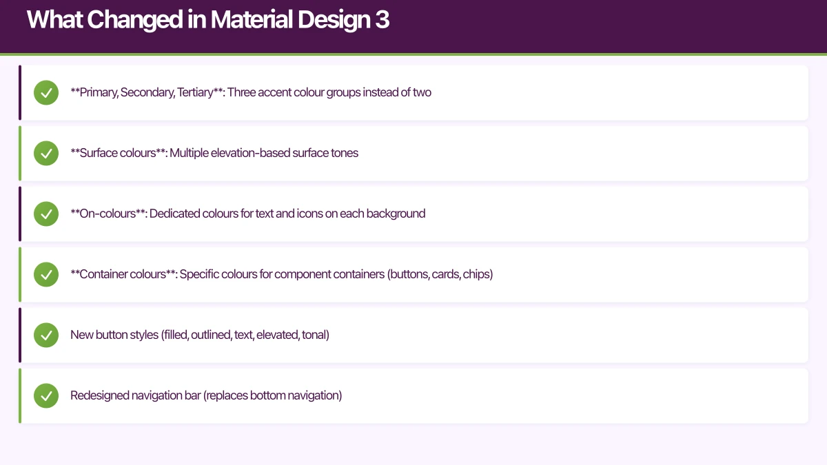
Material Design 3 replaces the old primary/secondary colour system with a more nuanced scheme:
- Primary, Secondary, Tertiary: Three accent colour groups instead of two
- Surface colours: Multiple elevation-based surface tones
- On-colours: Dedicated colours for text and icons on each background
- Container colours: Specific colours for component containers (buttons, cards, chips)
Updated Components
Many Material components have been redesigned:
- New button styles (filled, outlined, text, elevated, tonal)
- Redesigned navigation bar (replaces bottom navigation)
- Updated cards, chips, and dialogs
- New top app bar variants
Updated Typography
The type scale has been simplified to five categories with three sizes each:
- Display (large, medium, small)
- Headline (large, medium, small)
- Title (large, medium, small)
- Body (large, medium, small)
- Label (large, medium, small
 )
)
Setup
Dependencies
Add the Material Design 3 library:
// build.gradle (app)
dependencies {
    // For View-based UI
    implementation 'com.google.android.material:material:1.6.0'

    // For Jetpack Compose
    implementation 'androidx.compose.material3:material3:1.0.0-alpha11'
}
Theme Configuration (View System)
Create your Material Design 3 theme:
{/* res/values/themes.xml */}
<style name="Theme.MyApp" parent="Theme.Material3.DayNight.NoActionBar">
    {/* Primary */}
    <item name="colorPrimary">@color/md_theme_primary</item>
    <item name="colorOnPrimary">@color/md_theme_onPrimary</item>
    <item name="colorPrimaryContainer">@color/md_theme_primaryContainer</item>
    <item name="colorOnPrimaryContainer">@color/md_theme_onPrimaryContainer</item>

    {/* Secondary */}
    <item name="colorSecondary">@color/md_theme_secondary</item>
    <item name="colorOnSecondary">@color/md_theme_onSecondary</item>
    <item name="colorSecondaryContainer">@color/md_theme_secondaryContainer</item>
    <item name="colorOnSecondaryContainer">@color/md_theme_onSecondaryContainer</item>

    {/* Tertiary */}
    <item name="colorTertiary">@color/md_theme_tertiary</item>
    <item name="colorOnTertiary">@color/md_theme_onTertiary</item>
    <item name="colorTertiaryContainer">@color/md_theme_tertiaryContainer</item>
    <item name="colorOnTertiaryContainer">@color/md_theme_onTertiaryContainer</item>

    {/* Background and Surface */}
    <item name="android:colorBackground">@color/md_theme_background</item>
    <item name="colorOnBackground">@color/md_theme_onBackground</item>
    <item name="colorSurface">@color/md_theme_surface</item>
    <item name="colorOnSurface">@color/md_theme_onSurface</item>

    {/* Error */}
    <item name="colorError">@color/md_theme_error</item>
    <item name="colorOnError">@color/md_theme_onError</item>
</style>
Use the Material Theme Builder
Google provides the Material Theme Builder tool (material-foundation.github.io) that generates complete colour schemes from a single seed colour. Export the generated colours directly into your Android project.
Jetpack Compose Theme
@Composable
fun MyAppTheme(
    darkTheme: Boolean = isSystemInDarkTheme(),
    dynamicColour: Boolean = true,
    content: @Composable () -> Unit
) {
    val colourScheme = when {
        dynamicColour && Build.VERSION.SDK_INT >= Build.VERSION_CODES.S -> {
            val context = LocalContext.current
            if (darkTheme) dynamicDarkColorScheme(context)
            else dynamicLightColorScheme(context)
        }
        darkTheme -> darkColorScheme(
            primary = Purple80,
            onPrimary = Purple20,
            primaryContainer = Purple30,
            onPrimaryContainer = Purple90,
            secondary = Green80,
            onSecondary = Green20,
            // ... complete scheme
        )
        else -> lightColorScheme(
            primary = Purple40,
            onPrimary = Color.White,
            primaryContainer = Purple90,
            onPrimaryContainer = Purple10,
            secondary = Green40,
            onSecondary = Color.White,
            // ... complete scheme
        )
    }

    MaterialTheme(
        colorScheme = colourScheme,
        typography = AppTypography,
        content = content
    )
}
Dynamic Colour
Dyna
mic colour works on Android 12 and above. On older devices, fall back to your custom colour scheme:
val useDynamicColour = Build.VERSION.SDK_INT >= Build.VERSION_CODES.S

val colourScheme = if (useDynamicColour) {
    val context = LocalContext.current
    if (isSystemInDarkTheme()) {
        dynamicDarkColorScheme(context)
    } else {
        dynamicLightColorScheme(context)
    }
} else {
    // Your custom colour scheme for older devices
    if (isSystemInDarkTheme()) DarkColourScheme else LightColourScheme
}
Using Theme Colours
Always reference theme colours rather than hardcoding values:
// Compose
@Composable
fun ProfileCard() {
    Card(
        colors = CardDefaults.cardColors(
            containerColor = MaterialTheme.colorScheme.surfaceVariant,
        )
    ) {
        Text(
            text = "User Name",
            style = MaterialTheme.typography.titleMedium,
            color = MaterialTheme.colorScheme.onSurfaceVariant,
        )
    }
}

// XML
<com.google.android.material.card.MaterialCardView
    android:layout_width="match_parent"
    android:layout_height="wrap_content"
    app:cardBackgroundColor="?attr/colorSurfaceVariant">

    <TextView
        android:layout_width="wrap_content"
        android:layout_height="wrap_content"
        android:textColor="?attr/colorOnSurfaceVariant"
        android:textAppearance="?attr/textAppearanceTitleMedium" />
</com.google.android.material.card.MaterialCardView>
Updated
Components
Buttons
Material Design 3 introduces five button types with clear hierarchy:
@Composable
fun ButtonShowcase() {
    Column(verticalArrangement = Arrangement.spacedBy(8.dp)) {
        // Highest emphasis
        Button(onClick = { }) {
            Text("Filled Button")
        }

        // Medium-high emphasis
        FilledTonalButton(onClick = { }) {
            Text("Tonal Button")
        }

        // Medium emphasis
        ElevatedButton(onClick = { }) {
            Text("Elevated Button")
        }

        // Medium-low emphasis
        OutlinedButton(onClick = { }) {
            Text("Outlined Button")
        }

        // Lowest emphasis
        TextButton(onClick = { }) {
            Text("Text Button")
        }
    }
}
Navigation Bar
The new Navigation Bar replaces Bottom Navigation:
@Composable
fun AppNavigationBar(
    selectedTab: Int,
    onTabSelected: (Int) -> Unit
) {
    NavigationBar {
        NavigationBarItem(
            selected = selectedTab == 0,
            onClick = { onTabSelected(0) },
            icon = {
                Icon(Icons.Default.Home, contentDescription = "Home")
            },
            label = { Text("Home") }
        )
        NavigationBarItem(
            selected = selectedTab == 1,
            onClick = { onTabSelected(1) },
            icon = {
                Icon(Icons.Default.Search, contentDescription = "Search")
            },
            label = { Text("Search") }
        )
        NavigationBarItem(
            selected = selectedTab == 2,
            onClick = { onTabSelected(2) },
            icon = {
                Icon(Icons.Default.Person, contentDescription = "Profile")
            },
            label = { Text("Profile") }
        )
    }
}
Top App Bar
Material Design 3 top app bars have new scroll behaviours:
@OptIn(ExperimentalMaterial3Api::class)
@Composable
fun MainScreen() {
    val scrollBehavior = TopAppBarDefaults.pinnedScrollBehavior()

    Scaffold(
        topBar = {
            TopAppBar(
                title = { Text("My App") },
                navigationIcon = {
                    IconButton(onClick = { }) {
                        Icon(Icons.Default.Menu, "Menu")
                    }
                },
                actions = {
                    IconButton(onClick = { }) {
                        Icon(Icons.Default.Search, "Search")
                    }
                },
                scrollBehavior = scrollBehavior,
            )
        },
        modifier = Modifier.nestedScroll(
            scrollBehavior.nestedScrollConnection
        ),
    ) { padding ->
        LazyColumn(contentPadding = padding) {
            // Content
        }
    }
}
Cards
Material Design 3 offers three card variants:
@Composable
fun CardVariants() {
    Column(verticalArrangement = Arrangement.spacedBy(16.dp)) {
        // Filled card (default)
        Card(
            colors = CardDefaults.cardColors(
                containerColor = MaterialTheme.colorScheme.surfaceVariant,
            )
        ) {
            CardContent()
        }

        // Elevated card
        ElevatedCard {
            CardContent()
        }

        // Outlined card
        OutlinedCard {
            CardContent()
        }
    }
}
Typography
Define Your Type Scale
val AppTypography = Typography(
    displayLarge = TextStyle(
        fontFamily = FontFamily.Default,
        fontWeight = FontWeight.Normal,
        fontSize = 57.sp,
        lineHeight = 64.sp,
        letterSpacing = (-0.25).sp,
    ),
    headlineMedium = TextStyle(
        fontFamily = FontFamily.Default,
        fontWeight = FontWeight.Normal,
        fontSize = 28.sp,
        lineHeight = 36.sp,
    ),
    titleLarge = TextStyle(
        fontFamily = FontFamily.Default,
        fontWeight = FontWeight.Normal,
        fontSize = 22.sp,
        lineHeight = 28.sp,
    ),
    bodyLarge = TextStyle(
        fontFamily = FontFamily.Default,
        fontWeight = FontWeight.Normal,
        fontSize = 16.sp,
        lineHeight = 24.sp,
        letterSpacing = 0.5.sp,
    ),
    bodyMedium = TextStyle(
        fontFamily = FontFamily.Default,
        fontWeight = FontWeight.Normal,
        fontSize = 14.sp,
        lineHeight = 20.sp,
        letterSpacing = 0.25.sp,
    ),
    labelSmall = TextStyle(
        fontFamily = FontFamily.Default,
        fontWeight = FontWeight.Medium,
        fontSize = 11.sp,
        lineHeight = 16.sp,
        letterSpacing = 0.5.sp,
    ),
)
Using Typography
Text(
    text = "Page Title",
    style = MaterialTheme.typography.headlineMedium,
)

Text(
    text = "Body content goes here",
    style = MaterialTheme.typography.bodyLarge,
)

Text(
    text = "LABEL",
    style = MaterialTheme.typography.labelSmall,
)
Migration from Material Design 2
Colour Mapping
| Material Design 2 | Material Design 3 |
|---|---|
| colorPrimary | colorPrimary |
| colorPrimaryVariant | colorPrimaryContainer |
| colorSecondary | colorSecondary |
| colorSecondaryVariant | colorTertiaryContainer |
| colorSurface | colorSurface |
| colorBackground | colorBackground (now android:colorBackground) |
Component Migration
| MD2 Component | MD3 Replacement |
|---|---|
| BottomNavigation | NavigationBar |
| BottomNavigationItem | NavigationBarItem |
| FloatingActionButton | FloatingActionButton (restyled) |
| TopAppBar | TopAppBar, MediumTopAppBar, LargeTopAppBar |
| Card | Card, ElevatedCard, OutlinedCard |
Gradual Migration Strategy
You do not need to migrate everything at once. Material Design 3 components coexist with Material Design 2 components:
- Update your theme to Material Design 3
- Migrate global components first (app bars, navigation, FAB)
- Migrate screen-level components progressively
- Update individual UI elements last
Conclusion
Material Design 3 is a meaningful upgrade that makes your Android app feel native to the modern Android experience. Dynamic colour personalises every user’s experience, the updated components look contemporary, and the refined colour system gives you more design flexibility.
Start with the theme and dynamic colour support, then progressively update components. The Material Theme Builder tool makes generating a complete colour scheme straightforward, and the Compose integration is particularly clean.
For help implementing Material Design 3 in your Android app, contact eawesome. We build beautiful, modern Android applications for Australian businesses.
How does your app strategy fit into long-term digital transformation? Ash Ganda writes about the frameworks that connect mobile innovation to business outcomes.
Ganda Tech Services brings together cloud infrastructure, web development, and mobile app expertise to help Australian businesses thrive in the digital economy.
Talk to a Sydney app developer — free.
30 minutes. We'll tell you what your app needs, how long it takes, and what it costs. Real answers, no sales pitch.
Book Free App Strategy Call →Free · 30 minutes · No obligation