Implementing Dark Mode in iOS and Android Applications
Dark mode has moved from a niche preference to a standard expectation. Both iOS and Android have had system-level dark mode support for several years now, and users increasingly expect apps to respect their system preference. Beyond user preference, dark mode reduces battery consumption on OLED displays and improves readability in low-light environments.
This guide walks through implementing dark mode properly on both iOS and Android, covering system integration, custom colour schemes, image handling, and the edge cases that trip teams up.
iOS Dark Mode Implementation
Semantic Colours
The foundation of iOS dark mode support is semantic colours. Instead of hardcoding hex values, use system-defined colours that automatically adapt:
// These colours automatically adapt to light/dark mode
let backgroundColor = UIColor.systemBackground
let primaryText = UIColor.label
let secondaryText = UIColor.secondaryLabel
let separator = UIColor.separator
let groupedBackground = UIColor.systemGroupedBackground
In SwiftUI, these are available as:
struct ContentView: View {
    var body: some View {
        VStack {
            Text("Primary Text")
                .foregroundColor(.primary)
            Text("Secondary Text")
                .foregroundColor(.secondary)
        }
        .background(Color(.systemBackground))
    }
}
Custom Colour Assets
For brand colours that need different values in light and dark mode, use Asset Catalogs:
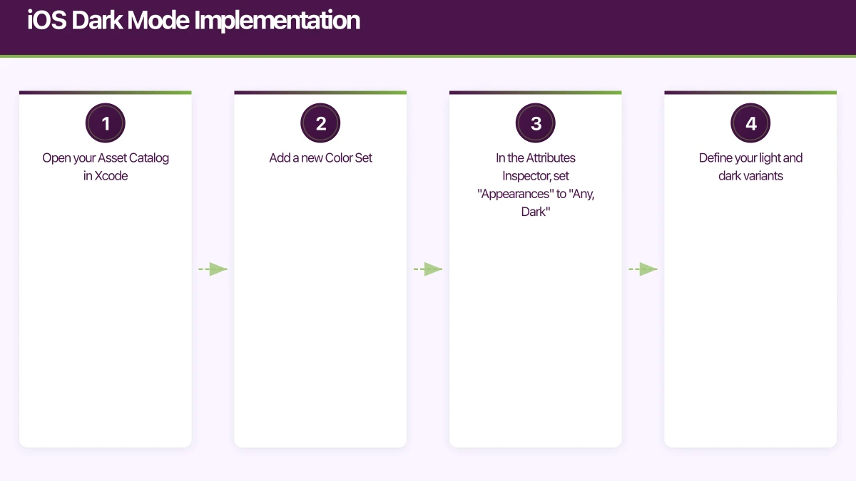
- Open your Asset Catalog in Xcode
- Add a new Color Set
- In the Attributes Inspector, set “Appearances” to “Any, Dark”
- Define your light and dark variants
Then reference them in code:
// UIKit
let brandColor = UIColor(named: "BrandPrimary")

// SwiftUI
let brandColor = Color("BrandPrimary")
This is the cleanest approach because it centralises your colour definitions and lets designers update them without touching code.
Handling Images
Images often need adaptation for dark mode. You have several strategies:
Template Images: For icons and simple graphics, use template rendering mode. The system tints them with the current label colour:
let icon = UIImage(named: "settings")?.withRenderingMode(.alwaysTemplate)
imageView.image = icon
imageView.tintColor = .label
Separate Assets: For complex images that look wrong when tinted, provide separate light and dark variants in the Asset Catalog, using the same “Any, Dark” appearance setting as colours.
SF Symbols: If you are using SF Symbols (and you should be), they automatically adapt to the current appearance:
let image = UIImage(systemName: "gear")
// Automatically uses appropriate weight and colour for current mode
Overriding Mode Per Screen
Some screens may need to force a specific appearance. For example, a photo viewer might always use a dark background:
// UIKit
override func viewDidLoad() {
    super.viewDidLoad()
    overrideUserInterfaceStyle = .dark
}

// SwiftUI
PhotoViewerView()
    .preferredColorScheme(.dark)
Detecting Mode Changes
To respond to real-time dark mode changes:
// UIKit
override func traitCollectionDidChange(
    _ previousTraitCollection: UITraitCollection?
) {
    super.traitCollectionDidChange(previousTraitCollection)

    if traitCollection.hasDifferentColorAppearance(
        comparedTo: previousTraitCollection
    ) {
        updateCustomViews()
    }
}

// SwiftUI
@Environment(\.colorScheme) var colorScheme

var body: some View {
    Text("Hello")
        .foregroundColor(colorScheme == .dark ? .white : .black)
}
Android Dark Theme Implemen
 tation
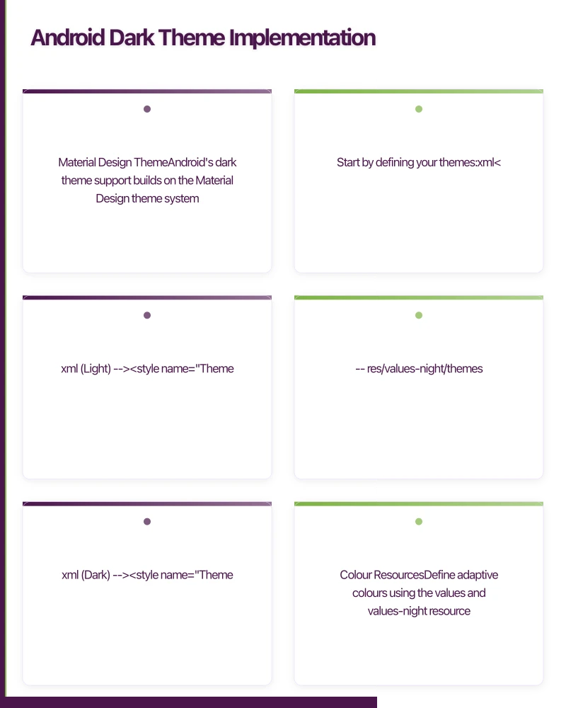
Material Design Theme
Android’s dark theme support builds on the Material Design theme system. Start by defining your themes:
{/* res/values/themes.xml (Light) */}
<style name="Theme.MyApp" parent="Theme.MaterialComponents.DayNight">
    <item name="colorPrimary">@color/purple_500</item>
    <item name="colorPrimaryVariant">@color/purple_700</item>
    <item name="colorOnPrimary">@color/white</item>
    <item name="colorSecondary">@color/teal_200</item>
    <item name="colorSecondaryVariant">@color/teal_700</item>
    <item name="colorOnSecondary">@color/black</item>
</style>

{/* res/values-night/themes.xml (Dark) */}
<style name="Theme.MyApp" parent="Theme.MaterialComponents.DayNight">
    <item name="colorPrimary">@color/purple_200</item>
    <item name="colorPrimaryVariant">@color/purple_700</item>
    <item name="colorOnPrimary">@color/black</item>
    <item name="colorSecondary">@color/teal_200</item>
    <item name="colorSecondaryVariant">@color/teal_200</item>
    <item name="colorOnSecondary">@color/black</item>
</style>
The DayNight parent theme automatically switches between light and dark based on the system setting.
Colour Resources
Define adaptive colours using the values and values-night resource directories:
{/* res/values/colors.xml */}
<color name="background">#FFFFFF</color>
<color name="surface">#FFFFFF</color>
<color name="on_background">#000000</color>
<color name="on_surface">#000000</color>

{/* res/values-night/colors.xml */}
<color name="background">#121212</color>
<color name="surface">#1E1E1E</color>
<color name="on_background">#FFFFFF</color>
<color name="on_surface">#FFFFFF</color>
Jetpack Compose Theming
If you are using Jetpack Compose, the theming system is more straightforward:
@Composable
fun MyAppTheme(
    darkTheme: Boolean = isSystemInDarkTheme(),
    content: @Composable () -> Unit
) {
    val colors = if (darkTheme) {
        darkColors(
            primary = Purple200,
            primaryVariant = Purple700,
            secondary = Teal200,
            background = Color(0xFF121212),
            surface = Color(0xFF1E1E1E),
            onPrimary = Color.Black,
            onSecondary = Color.Black,
            onBackground = Color.White,
            onSurface = Color.White
        )
    } else {
        lightColors(
            primary = Purple500,
            primaryVariant = Purple700,
            secondary = Teal200,
            background = Color.White,
            surface = Color.White
        )
    }

    MaterialTheme(
        colors = colors,
        typography = Typography,
        shapes = Shapes,
        content = content
    )
}
Programmatic Mode Control
Allow users to override the system setting within your app:
class SettingsRepository(private val prefs: SharedPreferences) {

    companion object {
        const val KEY_THEME = "theme_mode"
        const val THEME_SYSTEM = 0
        const val THEME_LIGHT = 1
        const val THEME_DARK = 2
    }

    fun getThemeMode(): Int = prefs.getInt(KEY_THEME, THEME_SYSTEM)

    fun setThemeMode(mode: Int) {
        prefs.edit().putInt(KEY_THEME, mode).apply()
        applyTheme(mode)
    }

    fun applyTheme(mode: Int) {
        when (mode) {
            THEME_LIGHT -> AppCompatDelegate.setDefaultNightMode(
                AppCompatDelegate.MODE_NIGHT_NO
            )
            THEME_DARK -> AppCompatDelegate.setDefaultNightMode(
                AppCompatDelegate.MODE_NIGHT_YES
            )
            else -> AppCompatDelegate.setDefaultNightMode(
                AppCompatDelegate.MODE_NIGHT_FOLLOW_SYSTEM
            )
        }
    }
}
Call applyTheme on app startup to restore the user’s preference.
Cross-Platform Consider
ations
Flutter
Flutter makes dark mode relatively simple with its ThemeData system:
MaterialApp(
  theme: ThemeData(
    brightness: Brightness.light,
    primarySwatch: Colors.blue,
    scaffoldBackgroundColor: Colors.white,
  ),
  darkTheme: ThemeData(
    brightness: Brightness.dark,
    primarySwatch: Colors.blue,
    scaffoldBackgroundColor: Color(0xFF121212),
  ),
  themeMode: ThemeMode.system, // Follows system setting
)
React Native
React Native provides the useColorScheme hook:
import { useColorScheme } from 'react-native';

function App() {
  const colorScheme = useColorScheme();
  const isDark = colorScheme === 'dark';

  return (
    <View style={{
      backgroundColor: isDark ? '#121212' : '#FFFFFF',
      flex: 1,
    }}>
      <Text style={{
        color: isDark ? '#FFFFFF' : '#000000',
      }}>
        Hello World
      </Text>
    </View>
  );
}
Design Guidelines for Dar
k Mode
Implementing dark mode is not simply inverting colours. Follow these design principles:
Use Elevation Instead of Shadows
In dark mode, shadows are invisible against dark backgrounds. Use surface colour elevation instead:
- Background: #121212
- Surface at 1dp elevation: #1E1E1E
- Surface at 2dp elevation: #222222
- Surface at 4dp elevation: #272727
- Surface at 8dp elevation: #2C2C2C
Higher elevation surfaces are lighter, creating a sense of depth without shadows.
Reduce Saturation
Fully saturated colours that work in light mode can be harsh in dark mode. Desaturate your palette:
- Light mode primary: #1976D2 (saturated blue)
- Dark mode primary: #90CAF9 (desaturated, lighter blue)
Avoid Pure Black
Pure black (#000000) backgrounds create excessive contrast with white text and can cause a “smearing” effect on OLED displays when scrolling. Use #121212 or similar dark grey instead.
Test Contrast Ratios
WCAG guidelines require a contrast ratio of at least 4.5:1 for normal text and 3:1 for large text. Verify your dark mode colours meet these requirements. Tools like the WebAIM Contrast Checker help with this.
Common Pitfalls
-
Hardcoded colours: The single biggest issue. Audit your codebase for hardcoded hex values and replace them with semantic or themed colours.
-
WebViews: WebViews do not automatically inherit your app’s dark mode. You need to inject CSS or use the
prefers-color-schememedia query in your web content. -
Third-party SDKs: Some SDKs render their own UI and may not support dark mode. Test all third-party UI components in both modes.
-
Screenshots and marketing: Remember to update your App Store screenshots to include dark mode variants. Many users browse the store in dark mode and appreciate seeing that your app supports it.
-
Status bar: Ensure the status bar style updates correctly when switching modes. A dark status bar on a dark background makes the time and battery invisible.
Conclusion
Dark mode is no longer optional for professional mobile applications. Users expect it, and both platforms provide the tools to implement it well. The key is to build on semantic colour systems from the start rather than retrofitting dark mode onto hardcoded colour values.
Start with the platform’s built-in semantic colours, layer on custom colour assets for your brand, handle images thoughtfully, and give users control over their preference. The result is an app that feels native and polished in any lighting condition.
If you need help implementing dark mode or rebuilding your app’s theming system, get in touch with eawesome. We have helped Australian businesses deliver polished, professional apps that look great around the clock.
Your app needs secure, low-latency APIs. Cloud Geeks builds and manages cloud backends optimised for mobile applications.
Awesome Apps is the mobile development division of Ganda Tech Services, building iOS and Android apps for Australian businesses.
Talk to a Sydney app developer — free.
30 minutes. We'll tell you what your app needs, how long it takes, and what it costs. Real answers, no sales pitch.
Book Free App Strategy Call →Free · 30 minutes · No obligation