Flutter Web and Desktop: Beyond Mobile Development
Flutter is no longer just a mobile framework. With Flutter web reaching stable in March 2021 and desktop support for Windows, macOS, and Linux progressing through 2022, Flutter is becoming a genuine multi-platform toolkit. A single codebase can now target iOS, Android, web, Windows, macOS, and Linux.
But “write once, run anywhere” has always been a more nuanced promise than the marketing suggests. This guide covers how to practically extend your Flutter app beyond mobile, what works well, what requires platform-specific attention, and the architectural patterns that make multi-platform Flutter sustainable.
Current Platform Status (July 2022)
-
iOS and Android: Stable, production-ready. This is Flutter’s home turf.
-
Web: Stable. Best suited for app-like web experiences rather than content-heavy websites.
-
Windows: Stable as of Flutter 3.0 (May 2022).
-
macOS: Stable as of Flutter 3.0.
-
Linux: Stable as of Flutter 3.0.
The Flutter 3.0 release in May 2022 was a milestone, bringing all six platforms to stable status.
Platform Detection and Adaptive UI
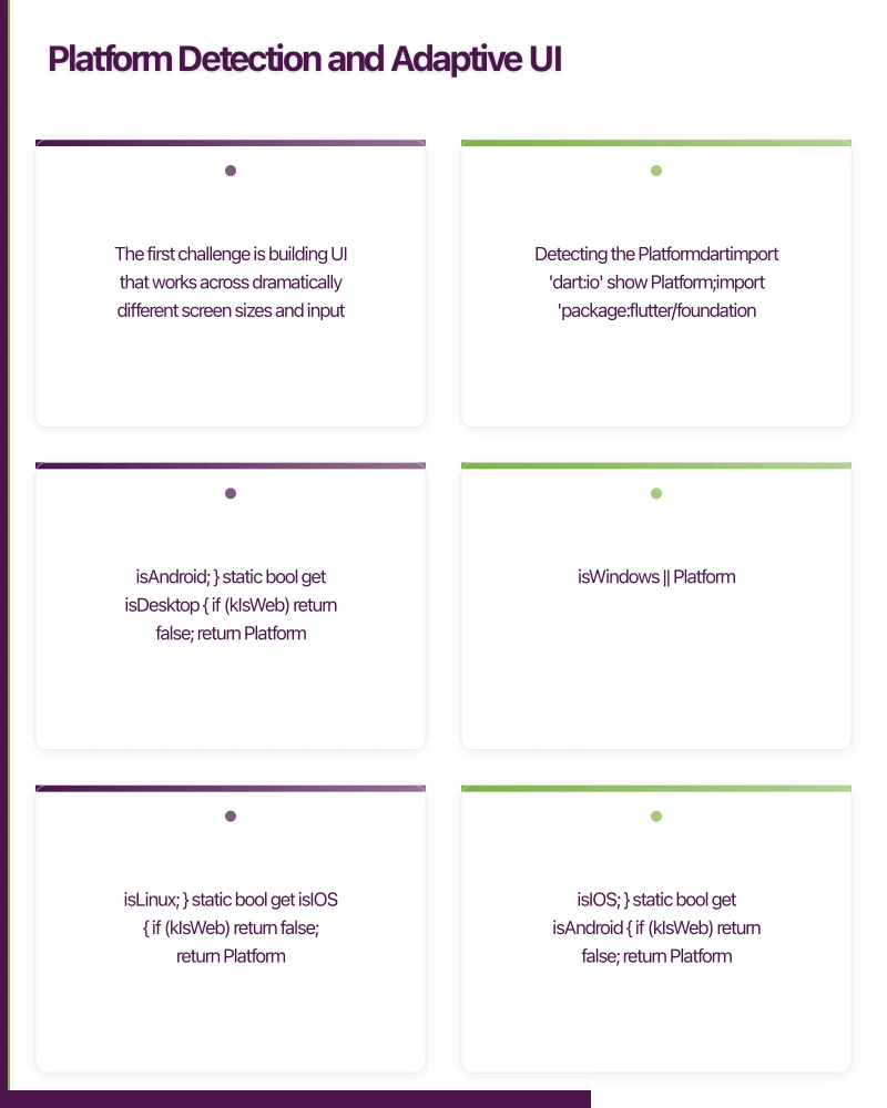
The first challenge is building UI that works across dramatically different screen sizes and input methods.
Detecting the Platform
import 'dart:io' show Platform;
import 'package:flutter/foundation.dart' show kIsWeb;

class PlatformInfo {
  static bool get isWeb => kIsWeb;

  static bool get isMobile {
    if (kIsWeb) return false;
    return Platform.isIOS || Platform.isAndroid;
  }

  static bool get isDesktop {
    if (kIsWeb) return false;
    return Platform.isWindows || Platform.isMacOS || Platform.isLinux;
  }

  static bool get isIOS {
    if (kIsWeb) return false;
    return Platform.isIOS;
  }

  static bool get isAndroid {
    if (kIsWeb) return false;
    return Platform.isAndroid;
  }
}
Responsive Layout Builder
Rather than detecting platforms, design for screen size:
class ResponsiveLayout extends StatelessWidget {
  final Widget mobile;
  final Widget? tablet;
  final Widget desktop;

  const ResponsiveLayout({
    Key? key,
    required this.mobile,
    this.tablet,
    required this.desktop,
  }) : super(key: key);

  static const double mobileBreakpoint = 600;
  static const double tabletBreakpoint = 1024;

  @override
  Widget build(BuildContext context) {
    return LayoutBuilder(
      builder: (context, constraints) {
        if (constraints.maxWidth >= tabletBreakpoint) {
          return desktop;
        } else if (constraints.maxWidth >= mobileBreakpoint) {
          return tablet ?? desktop;
        } else {
          return mobile;
        }
      },
    );
  }
}

// Usage
ResponsiveLayout(
  mobile: MobileHomeScreen(),
  tablet: TabletHomeScreen(),
  desktop: DesktopHomeScreen(),
)
Adaptive Navigation
Mobile uses bottom navigation. Desktop and web use a side navigation rail or drawer:
class AdaptiveScaffold extends StatelessWidget {
  final int selectedIndex;
  final ValueChanged<int> onDestinationSelected;
  final List<NavigationItem> destinations;
  final Widget body;

  const AdaptiveScaffold({
    Key? key,
    required this.selectedIndex,
    required this.onDestinationSelected,
    required this.destinations,
    required this.body,
  }) : super(key: key);

  @override
  Widget build(BuildContext context) {
    return LayoutBuilder(
      builder: (context, constraints) {
        if (constraints.maxWidth >= 1024) {
          // Desktop: expanded sidebar
          return Row(
            children: [
              NavigationDrawer(
                selectedIndex: selectedIndex,
                onDestinationSelected: onDestinationSelected,
                destinations: destinations,
              ),
              const VerticalDivider(width: 1),
              Expanded(child: body),
            ],
          );
        } else if (constraints.maxWidth >= 600) {
          // Tablet: navigation rail
          return Row(
            children: [
              NavigationRail(
                selectedIndex: selectedIndex,
                onDestinationSelected: onDestinationSelected,
                destinations: destinations
                    .map((d) => NavigationRailDestination(
                          icon: Icon(d.icon),
                          label: Text(d.label),
                        ))
                    .toList(),
              ),
              const VerticalDivider(width: 1),
              Expanded(child: body),
            ],
          );
        } else {
          // Mobile: bottom navigation
          return Scaffold(
            body: body,
            bottomNavigationBar: BottomNavigationBar(
              currentIndex: selectedIndex,
              onTap: onDestinationSelected,
              items: destinations
                  .map((d) => BottomNavigationBarItem(
                        icon: Icon(d.icon),
                        label: d.label,
                      ))
                  .toList(),
            ),
          );
        }
      },
    );
  }
}
In
 put Handling
Desktop and web users expect keyboard and mouse support, not just touch.
Mouse Hover Effects
class HoverCard extends StatefulWidget {
  final Widget child;
  final VoidCallback? onTap;

  const HoverCard({Key? key, required this.child, this.onTap}) : super(key: key);

  @override
  State<HoverCard> createState() => _HoverCardState();
}

class _HoverCardState extends State<HoverCard> {
  bool _isHovered = false;

  @override
  Widget build(BuildContext context) {
    return MouseRegion(
      onEnter: (_) => setState(() => _isHovered = true),
      onExit: (_) => setState(() => _isHovered = false),
      cursor: SystemMouseCursors.click,
      child: AnimatedContainer(
        duration: const Duration(milliseconds: 200),
        transform: _isHovered
            ? (Matrix4.identity()..scale(1.02))
            : Matrix4.identity(),
        decoration: BoxDecoration(
          borderRadius: BorderRadius.circular(12),
          boxShadow: [
            BoxShadow(
              color: Colors.black.withOpacity(_isHovered ? 0.15 : 0.05),
              blurRadius: _isHovered ? 12 : 4,
              offset: Offset(0, _isHovered ? 4 : 2),
            ),
          ],
        ),
        child: GestureDetector(
          onTap: widget.onTap,
          child: widget.child,
        ),
      ),
    );
  }
}
Keyboard Shortcuts
class DesktopShortcuts extends StatelessWidget {
  final Widget child;

  const DesktopShortcuts({Key? key, required this.child}) : super(key: key);

  @override
  Widget build(BuildContext context) {
    return Shortcuts(
      shortcuts: {
        LogicalKeySet(LogicalKeyboardKey.control, LogicalKeyboardKey.keyN):
            const CreateNewIntent(),
        LogicalKeySet(LogicalKeyboardKey.control, LogicalKeyboardKey.keyS):
            const SaveIntent(),
        LogicalKeySet(LogicalKeyboardKey.control, LogicalKeyboardKey.keyF):
            const SearchIntent(),
        LogicalKeySet(LogicalKeyboardKey.escape):
            const DismissIntent(),
      },
      child: Actions(
        actions: {
          CreateNewIntent: CallbackAction<CreateNewIntent>(
            onInvoke: (_) => _handleCreate(context),
          ),
          SaveIntent: CallbackAction<SaveIntent>(
            onInvoke: (_) => _handleSave(context),
          ),
          SearchIntent: CallbackAction<SearchIntent>(
            onInvoke: (_) => _handleSearch(context),
          ),
        },
        child: child,
      ),
    );
  }
}
Right-Click Context Menus
Desktop users expect context menus:
class ContextMenuRegion extends StatelessWidget {
  final Widget child;
  final List<ContextMenuItem> menuItems;

  const ContextMenuRegion({
    Key? key,
    required this.child,
    required this.menuItems,
  }) : super(key: key);

  @override
  Widget build(BuildContext context) {
    return GestureDetector(
      onSecondaryTapDown: (details) {
        _showContextMenu(context, details.globalPosition);
      },
      child: child,
    );
  }

  void _showContextMenu(BuildContext context, Offset position) {
    showMenu(
      context: context,
      position: RelativeRect.fromLTRB(
        position.dx, position.dy, position.dx, position.dy,
      ),
      items: menuItems.map((item) => PopupMenuItem(
        value: item.action,
        child: Row(
          children: [
            Icon(item.icon, size: 18),
            const SizedBox(width: 8),
            Text(item.label),
          ],
        ),
      )).toList(),
    ).then((value) {
      if (value != null) value();
    });
  }
}
Flutter Web Considerat
ions
Rendering Modes
Flutter web offers two rendering modes:
- HTML renderer: Uses standard HTML elements and CSS. Better for text-heavy apps, smaller download size, better SEO.
- CanvasKit renderer: Uses WebAssembly and Skia. Pixel-perfect rendering matching mobile, better for graphics-heavy apps.
Choose during build:
# HTML renderer (smaller, better text)
flutter build web --web-renderer html

# CanvasKit (pixel-perfect, larger download)
flutter build web --web-renderer canvaskit

# Auto (HTML on mobile browsers, CanvasKit on desktop)
flutter build web --web-renderer auto
URL Routing
Web apps need proper URL routing:
MaterialApp.router(
  routerConfig: GoRouter(
    routes: [
      GoRoute(
        path: '/',
        builder: (context, state) => const HomeScreen(),
      ),
      GoRoute(
        path: '/products/:id',
        builder: (context, state) {
          final productId = state.params['id']!;
          return ProductDetailScreen(productId: productId);
        },
      ),
    ],
  ),
)
SEO Limitations
Flutter web renders to a canvas element, which means search engines cannot easily index the content. If SEO is critical for your web presence, Flutter web is not the right choice for your marketing site. It works well for authenticated app experiences where SEO is irrelevant.
Desktop-Specific Features
Window Management
import 'package:window_manager/window_manager.dart';

Future<void> configureDesktopWindow() async {
  if (PlatformInfo.isDesktop) {
    await windowManager.ensureInitialized();

    WindowOptions windowOptions = const WindowOptions(
      size: Size(1200, 800),
      minimumSize: Size(800, 600),
      center: true,
      title: 'My App',
    );

    windowManager.waitUntilReadyToShow(windowOptions, () async {
      await windowManager.show();
      await windowManager.focus();
    });
  }
}
File System Access
Desktop apps can access the local file system:
import 'package:file_picker/file_picker.dart';

Future<void> openFile() async {
  FilePickerResult? result = await FilePicker.platform.pickFiles(
    type: FileType.custom,
    allowedExtensions: ['pdf', 'doc', 'xlsx'],
  );

  if (result != null) {
    final file = File(result.files.single.path!);
    // Process the file
  }
}
Architecture for Multi-Platform
Platform-Specific Implementations
Use conditional imports for platform-specific code:
// storage_service.dart
export 'storage_service_stub.dart'
    if (dart.library.io) 'storage_service_native.dart'
    if (dart.library.html) 'storage_service_web.dart';
Shared Business Logic
Keep your business logic platform-agnostic:
// This code works on all platforms
class ProductRepository {
  final ApiClient _apiClient;
  final LocalCache _cache;

  ProductRepository(this._apiClient, this._cache);

  Future<List<Product>> getProducts() async {
    try {
      final products = await _apiClient.fetchProducts();
      await _cache.saveProducts(products);
      return products;
    } catch (e) {
      return await _cache.getProducts();
    }
  }
}
When to Use Flutter Multi-Platform
Good fit: Internal business tools, dashboards, productivity apps, content consumption apps where you want code sharing across mobile and desktop.
Poor fit: Content marketing websites (SEO), games requiring platform-specific graphics APIs, apps deeply integrated with platform-specific features.
Conclusion
Flutter’s expansion to web and desktop opens real opportunities for code sharing across platforms. The framework handles the rendering consistently, but you need to invest in responsive layouts, input adaptation, and platform-specific features to deliver a native-feeling experience on each platform.
Start with mobile, then expand to web or desktop as your product requires. The architecture patterns in this guide ensure your codebase stays maintainable as you add platforms.
For help building multi-platform Flutter applications, contact eawesome. We build Flutter apps that work beautifully on every screen for Australian businesses.
A dedicated website amplifies your app’s reach. Cosmos Web Tech builds SEO-optimised sites that turn Google searches into app installs.
Awesome Apps operates under the Ganda Tech Services umbrella, delivering end-to-end technology solutions for Australian businesses.
Talk to a Sydney app developer — free.
30 minutes. We'll tell you what your app needs, how long it takes, and what it costs. Real answers, no sales pitch.
Book Free App Strategy Call →Free · 30 minutes · No obligation