Cross-Platform Design Systems for Mobile Applications
A design system is the single most effective investment you can make in the quality and consistency of your mobile app. When your team builds from shared components with agreed design tokens, every screen looks and behaves consistently. Development speeds up because designers and developers speak the same language. And maintaining quality across iOS and Android becomes manageable rather than chaotic.
This guide covers how to build a cross-platform design system that respects platform conventions while maintaining brand consistency.
What a Mobile Design System Includes
A complete mobile design system has four layers:
- Design Tokens: The atomic values (colours, spacing, typography, elevation) that define your visual language
- Components: Reusable UI elements built from tokens (buttons, cards, inputs, navigation)
- Patterns: Common screen layouts and interaction patterns (list-detail, forms, onboarding flows)
- Guidelines: Usage rules, accessibility requirements, and platform-specific adaptations
 Design Tokens
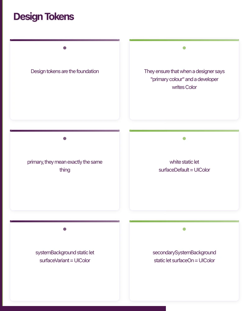
Design tokens are the foundation. They ensure that when a designer says “primary colour” and a developer writes Color.primary, they mean exactly the same thing.
Token Structure
{
  "color": {
    "primary": {
      "default": "#1A73E8",
      "light": "#4A90D9",
      "dark": "#0D47A1",
      "on": "#FFFFFF"
    },
    "secondary": {
      "default": "#34A853",
      "light": "#66BB6A",
      "dark": "#1B5E20",
      "on": "#FFFFFF"
    },
    "surface": {
      "default": "#FFFFFF",
      "variant": "#F5F5F5",
      "elevated": "#FFFFFF",
      "on": "#1C1B1F"
    },
    "error": {
      "default": "#B3261E",
      "on": "#FFFFFF"
    }
  },
  "spacing": {
    "xs": 4,
    "sm": 8,
    "md": 16,
    "lg": 24,
    "xl": 32,
    "xxl": 48
  },
  "radius": {
    "sm": 4,
    "md": 8,
    "lg": 12,
    "xl": 16,
    "full": 9999
  },
  "elevation": {
    "none": 0,
    "low": 2,
    "medium": 4,
    "high": 8,
    "highest": 12
  }
}
iOS Token Implementation
enum DesignToken {
    enum Color {
        static let primaryDefault = UIColor(hex: "#1A73E8")
        static let primaryLight = UIColor(hex: "#4A90D9")
        static let primaryDark = UIColor(hex: "#0D47A1")
        static let primaryOn = UIColor.white

        static let surfaceDefault = UIColor.systemBackground
        static let surfaceVariant = UIColor.secondarySystemBackground
        static let surfaceOn = UIColor.label
    }

    enum Spacing {
        static let xs: CGFloat = 4
        static let sm: CGFloat = 8
        static let md: CGFloat = 16
        static let lg: CGFloat = 24
        static let xl: CGFloat = 32
        static let xxl: CGFloat = 48
    }

    enum Radius {
        static let sm: CGFloat = 4
        static let md: CGFloat = 8
        static let lg: CGFloat = 12
        static let xl: CGFloat = 16
    }

    enum Typography {
        static let displayLarge = UIFont.systemFont(ofSize: 34, weight: .bold)
        static let headlineMedium = UIFont.systemFont(ofSize: 22, weight: .semibold)
        static let titleLarge = UIFont.systemFont(ofSize: 20, weight: .semibold)
        static let bodyLarge = UIFont.systemFont(ofSize: 16, weight: .regular)
        static let bodyMedium = UIFont.systemFont(ofSize: 14, weight: .regular)
        static let labelSmall = UIFont.systemFont(ofSize: 11, weight: .medium)
    }
}
Android Token Implementation
object DesignToken {
    object Color {
        val PrimaryDefault = android.graphics.Color.parseColor("#1A73E8")
        val PrimaryLight = android.graphics.Color.parseColor("#4A90D9")
        val PrimaryDark = android.graphics.Color.parseColor("#0D47A1")
    }

    object Spacing {
        val xs = 4.dp
        val sm = 8.dp
        val md = 16.dp
        val lg = 24.dp
        val xl = 32.dp
        val xxl = 48.dp
    }

    object Radius {
        val sm = 4.dp
        val md = 8.dp
        val lg = 12.dp
        val xl = 16.dp
    }
}

// Compose theme integration
val AppColors = lightColorScheme(
    primary = Color(0xFF1A73E8),
    onPrimary = Color.White,
    secondary = Color(0xFF34A853),
    onSecondary = Color.White,
    surface = Color.White,
    onSurface = Color(0xFF1C1B1F),
)
React Native / Flutter Token Implementation
// React Native tokens
export const tokens = {
  color: {
    primary: {
      default: '#1A73E8',
      light: '#4A90D9',
      dark: '#0D47A1',
      on: '#FFFFFF',
    },
    surface: {
      default: '#FFFFFF',
      variant: '#F5F5F5',
      on: '#1C1B1F',
    },
  },
  spacing: {
    xs: 4,
    sm: 8,
    md: 16,
    lg: 24,
    xl: 32,
    xxl: 48,
  },
  radius: {
    sm: 4,
    md: 8,
    lg: 12,
    xl: 16,
  },
  typography: {
    displayLarge: { fontSize: 34, fontWeight: '700' as const },
    headlineMedium: { fontSize: 22, fontWeight: '600' as const },
    bodyLarge: { fontSize: 16, fontWeight: '400' as const },
    bodyMedium: { fontSize: 14, fontWeight: '400' as const },
    labelSmall: { fontSize: 11, fontWeight: '500' as const },
  },
} as const;
Component Li
brary
Platform-Adaptive Button
Build components that respect platform conventions while maintaining brand consistency:
// iOS: Uses UIKit button styling conventions
struct PrimaryButton: View {
    let title: String
    let action: () -> Void
    var isLoading: Bool = false

    var body: some View {
        Button(action: action) {
            HStack(spacing: DesignToken.Spacing.sm) {
                if isLoading {
                    ProgressView()
                        .tint(.white)
                }
                Text(title)
                    .font(.system(size: 16, weight: .semibold))
            }
            .frame(maxWidth: .infinity)
            .padding(.vertical, DesignToken.Spacing.md)
            .background(Color(DesignToken.Color.primaryDefault))
            .foregroundColor(.white)
            .cornerRadius(DesignToken.Radius.lg)
        }
        .disabled(isLoading)
    }
}
// Android: Uses Material Design conventions
@Composable
fun PrimaryButton(
text: String,
onClick: () -> Unit,
modifier: Modifier = Modifier,
isLoading: Boolean = false,
) {
Button(
onClick = onClick,
modifier = modifier.fillMaxWidth(),
enabled = !isLoading,
shape = RoundedCornerShape(DesignToken.Radius.lg),
colors = ButtonDefaults.buttonColors(
containerColor = Color(DesignToken.Color.PrimaryDefault),
),
contentPadding = PaddingValues(vertical = DesignToken.Spacing.md),
) {
if (isLoading) {
CircularProgressIndicator(
modifier = Modifier.size(20.dp),
color = Color.White,
strokeWidth = 2.dp,
)
Spacer(modifier = Modifier.width(DesignToken.Spacing.sm))
}
Text(
text = text,
style = MaterialTheme.typography.labelLarge,
)
}
}Platform-Adaptive Input Field
// iOS
struct AppTextField: View {
    let label: String
    @Binding var text: String
    var error: String? = nil

    var body: some View {
        VStack(alignment: .leading, spacing: DesignToken.Spacing.xs) {
            Text(label)
                .font(.system(size: 14, weight: .medium))
                .foregroundColor(Color(DesignToken.Color.surfaceOn))

            TextField("", text: $text)
                .padding(DesignToken.Spacing.md)
                .background(Color(DesignToken.Color.surfaceVariant))
                .cornerRadius(DesignToken.Radius.md)
                .overlay(
                    RoundedRectangle(cornerRadius: DesignToken.Radius.md)
                        .stroke(
                            error != nil
                                ? Color.red
                                : Color.clear,
                            lineWidth: 1
                        )
                )

            if let error = error {
                Text(error)
                    .font(.system(size: 12))
                    .foregroundColor(.red)
            }
        }
    }
}
Card Component
@Composable
fun AppCard(
    modifier: Modifier = Modifier,
    elevation: Dp = DesignToken.Spacing.xs,
    content: @Composable ColumnScope.() -> Unit,
) {
    Card(
        modifier = modifier.fillMaxWidth(),
        shape = RoundedCornerShape(DesignToken.Radius.lg),
        elevation = CardDefaults.cardElevation(defaultElevation = elevation),
        colors = CardDefaults.cardColors(
            containerColor = MaterialTheme.colorScheme.surface,
        ),
    ) {
        Column(
            modifier = Modifier.padding(DesignToken.Spacing.md),
            content = content,
        )
    }
}
Platf
orm Adaptation
A good cross-platform design system is not about making iOS and Android look identical. It is about maintaining brand consistency while respecting each platform’s conventions.
What Should Be Consistent Across Platforms
- Brand colours and typography
- Spacing scale and sizing
- Component shapes and visual style
- Content hierarchy and information architecture
- Iconography style
What Should Differ Between Platforms
- Navigation: iOS uses tab bars at the bottom and back swipe gestures. Android uses navigation bars and the system back button.
- Typography: iOS uses SF Pro. Android uses Roboto. Your design system should specify custom fonts or defer to the system font.
- Dialogs: iOS uses action sheets and alerts. Android uses Material dialogs.
- Status bar: Different styling conventions on each platform.
- Haptic feedback: Different patterns and capabilities.
Token Automation
Single Source of Truth
Maintain tokens in a single format (JSON or YAML) and generate platform-specific code:
# Token pipeline
tokens.json
  -> generate-ios.js   -> DesignTokens.swift
  -> generate-android.js -> DesignTokens.kt
  -> generate-rn.js    -> tokens.ts
  -> generate-figma.js -> Figma variables
This automation ensures that when a designer updates a colour in the design tool, the change propagates to all platforms through a single source of truth.
Figma Integration
Use Figma’s design tokens plugin to export tokens from your design files. This bridges the gap between design and engineering, ensuring that what the designer sees is what the developer builds.
Documentation
Document every component with:
- Visual examples: Screenshots on both iOS and Android
- Usage guidelines: When to use this component and when to use alternatives
- Props/parameters: All configuration options
- Accessibility: Required accessibility attributes
- Do/Don’t examples: Common correct and incorrect usage
Conclusion
A cross-platform design system is an investment that pays dividends in consistency, speed, and quality. Start with tokens, build a core component set, adapt for platform conventions, and document everything.
The goal is not pixel-perfect consistency across platforms. The goal is a unified brand experience that feels native on every device.
For help building a design system for your mobile apps, contact eawesome. We create design systems that scale across platforms for Australian mobile products.
An app is part of a bigger picture. Ash Ganda explores how businesses can build cohesive digital strategies that connect mobile, web, and cloud.
Awesome Apps operates under the Ganda Tech Services umbrella, delivering end-to-end technology solutions for Australian businesses.
Talk to a Sydney app developer — free.
30 minutes. We'll tell you what your app needs, how long it takes, and what it costs. Real answers, no sales pitch.
Book Free App Strategy Call →Free · 30 minutes · No obligation