Designing Mobile App Onboarding That Converts Users
The first 60 seconds of a user’s experience with your app determine whether they become a long-term customer or a one-time downloader. Industry data shows that 25 percent of apps are used only once after download, and a significant portion of that abandonment happens during or immediately after onboarding.
Onboarding is not just a nice-to-have welcome screen. It is the critical bridge between a user’s expectation (set by your App Store listing) and the actual value your app delivers. Get it right, and you dramatically improve activation, retention, and lifetime value.
What Onboarding Actually Needs to Achieve
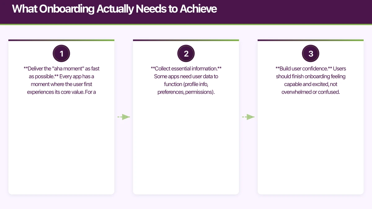
Effective onboarding serves three purposes:
-
Deliver the “aha moment” as fast as possible. Every app has a moment where the user first experiences its core value. For a photo editing app, it is applying their first filter. For a task manager, it is creating and completing their first task. Your onboarding should pave the shortest path to that moment.
-
Collect essential information. Some apps need user data to function (profile info, preferences, permissions). Onboarding is where you gather this, but only the minimum necessary.
-
Build user confidence. Users should finish onboarding feeling capable and excited, not overwhelmed or confused.
Onboarding
 Patterns That Work
Pattern 1: Progressive Onboarding
Instead of front-loading all information, progressive onboarding reveals features as users encounter them naturally. This is the most effective pattern for complex apps.
How it works:
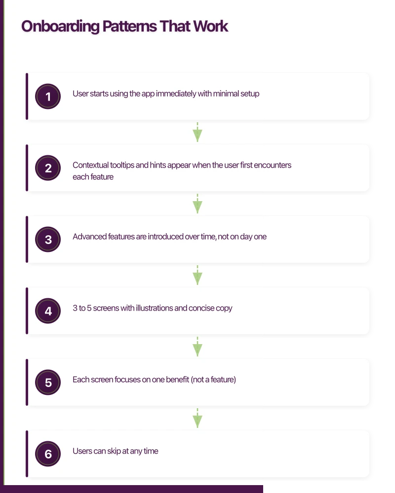
- User starts using the app immediately with minimal setup
- Contextual tooltips and hints appear when the user first encounters each feature
- Advanced features are introduced over time, not on day one
Best for: Productivity apps, social apps, tools with many features
Example flow:
- Sign up (email or social login)
- Immediately enter the app’s main screen
- A single tooltip highlights the primary action
- Additional guidance appears as users explore
Slack is an excellent example of progressive onboarding. New users join a workspace and immediately start using the app, with Slackbot providing contextual guidance as they discover features.
Pattern 2: Benefits-Oriented Walkthrough
A short series of screens (3 to 5) that highlight the app’s key benefits. This works when users need to understand the value proposition before investing time.
How it works:
- 3 to 5 screens with illustrations and concise copy
- Each screen focuses on one benefit (not a feature)
- Users can skip at any time
- Ends with a clear call to action (sign up, get started)
Best for: Apps with non-obvious value propositions, subscription apps that need to justify their price
Key rules:
- Show benefits, not features. “Save 2 hours per week” beats “Automated task scheduling”
- Keep copy under 20 words per screen
- Use illustrations that show the outcome, not the interface
- Always allow skipping. Forced walkthroughs increase abandonment
Pattern 3: Interactive Tutorial
Users learn by doing. The app guides them through a real task that demonstrates core functionality.
How it works:
- The user performs a real action (not a simulation)
- Step-by-step guidance walks them through the process
- The result is a real artefact they have created (a project, a profile, a workout plan)
Best for: Apps with a learning curve, creative tools, fitness and health apps
Example: A design app might guide new users through creating their first social media post, teaching them the key tools along the way. By the end, they have a real creation they can share.
Pattern 4: Personalisation Flow
Users answer questions that customise the app experience. This creates investment (the endowment effect) and enables a more relevant first experience.
How it works:
- 3 to 6 questions about goals, preferences, or experience level
- The app visibly configures itself based on answers
- The user enters a personalised experience
Best for: Health and fitness apps, content apps, learning platforms
Key to success: Every question must visibly impact the experience. If a question does not change anything, remove it. Users feel cheated if they invest time answering questions that seem to go nowhere.
The Anatomy of High-Co
nverting Onboarding
Regardless of which pattern you choose, high-converting onboarding flows share these characteristics:
Minimal Required Steps
Audit every step in your onboarding. For each one, ask: “Can the user get value from the app without this?” If yes, defer it.
Common steps that can be deferred:
- Profile photo upload (ask later, or never)
- Detailed preferences (learn from behaviour instead)
- Connecting other accounts (offer after the user is engaged)
- Enabling notifications (ask in context, not during sign-up)
Every additional required step reduces completion by 10 to 20 percent.
Clear Progress Indication
If your onboarding has multiple steps, show progress. A simple progress bar or step counter (“2 of 4”) reduces anxiety and encourages completion.
// SwiftUI progress indicator
struct OnboardingProgress: View {
    let currentStep: Int
    let totalSteps: Int

    var body: some View {
        HStack(spacing: 8) {
            ForEach(0 ..< totalSteps, id: \.self) { step in
                Circle()
                    .fill(step <= currentStep ? Color.blue : Color.gray.opacity(0.3))
                    .frame(width: 8, height: 8)
            }
        }
    }
}
Social Login Options
Offering social login (Apple Sign In, Google Sign In) dramatically reduces sign-up friction. In our experience with Australian apps, offering Apple Sign In alongside email registration increases conversion by 15 to 25 percent.
Since iOS 13, Apple requires apps that offer third-party social login to also offer Sign In with Apple. Compliance aside, it is a genuinely good user experience.
Meaningful Defaults
Pre-populate settings with sensible defaults. If your app targets the Australian market, default to:
- Australian English spelling
- Metric units
- AUD currency
- AEST/AEDT timezone (or detect from device)
- Australian date format (DD/MM/YYYY)
Every default you set correctly is one fewer decision the user has to
make.
Sign-Up Form Best Practices
If your onboarding requires account creation, the sign-up form is a critical conversion point.
Keep It Short
The ideal sign-up form has one to two fields. Email and password, or just email with a magic link. Every additional field reduces conversion.
If you need more information, collect it after the user has experienced value. A user who loves your app will happily complete their profile. A user who has not seen value yet will abandon a long form.
Use Smart Validation
Validate in real-time, not on submission. Show validation feedback as the user types:
// React Native inline validation example
const EmailInput = () => {
  const [email, setEmail] = useState('');
  const [isValid, setIsValid] = useState(null);

  const validateEmail = (text) => {
    setEmail(text);
    if (text.length === 0) {
      setIsValid(null);
    } else {
      const emailRegex = /^[^\s@]+@[^\s@]+\.[^\s@]+$/;
      setIsValid(emailRegex.test(text));
    }
  };

  return (
    <View>
      <TextInput
        value={email}
        onChangeText={validateEmail}
        placeholder="Email address"
        keyboardType="email-address"
        autoCapitalize="none"
      />
      {isValid === false && (
        <Text style={styles.error}>Please enter a valid email</Text>
      )}
    </View>
  );
};
Password Requirements
Show password requirements upfront, not as error messages after submission. Use a visual checklist that updates in real-time:
- At least 8 characters (currently 5 of 8)
- One uppercase letter (met)
- One number (not yet met)
This transforms a frustrating error loop into a gamified experience.
Permission Requests During Onboarding
Mobile apps often need permissions (camera, location, notifications, contacts). Requesting all permissions during onboarding is a common mistake.
The Right Approach
Request permissions only when the user understands why they are needed and is about to use the feature that requires them.
Location permission: Do not ask during onboarding. Ask when the user first accesses a location-dependent feature, with context: “To show events near you, we need your location.”
Camera permission: Ask when the user first taps a camera-related feature.
Notification permission: Ask after the user has completed a meaningful action (see our push notification best practices article for details).
The exception is permissions that are genuinely required for the app to function. A camera app needs camera permission immediately. A maps app needs location. In these cases, explain why before triggering the system prompt.
Measuring Onboarding Performance
You cannot improve onboarding without measuring it. Track these metrics:
Funnel Metrics
Map every step of your onboarding and measure completion rates between steps:
- App opened (100%)
- Sign-up started (X%)
- Sign-up completed (X%)
- First key action completed (X%)
- Returned on day 2 (X%)
Identify the biggest drop-off point and focus your optimisation efforts there.
Activation Rate
Define your activation event: the action that most strongly predicts long-term retention. This is your north star metric for onboarding.
For example:
- A task management app might define activation as “created 3 tasks within 7 days”
- A fitness app might define it as “completed first workout”
- A social app might define it as “connected with 5 friends”
Track what percentage of new users reach activation within a defined time window.
Time to Value
How long does it take from first open to the user experiencing core value? Measure this in seconds or taps. Shorter is almost always better.
A/B Testing Your Onboarding
Onboarding is one of the highest-leverage areas for A/B testing because small improvements compound across every new user.
Test these elements:
- Number of walkthrough screens (3 vs 4 vs 5)
- Copy variations (benefit-focused vs feature-focused)
- Sign-up form fields (email-only vs email plus name)
- Social login placement (above or below email form)
- CTA button copy (“Get Started” vs “Create Free Account”)
- Illustration style (photos vs illustrations vs screenshots)
Use Firebase A/B Testing or a tool like Optimizely to run controlled experiments. Run each test for at least two weeks to account for day-of-week variations.
Common Onboarding Mistakes
- Information overload. Showing all features at once overwhelms users. Introduce gradually.
- Forced walkthroughs that cannot be skipped. Respect the user’s time.
- Asking for too much too soon. Permissions, personal data, and credit cards should be deferred.
- No onboarding at all. Assuming your app is self-explanatory is risky.
- One-size-fits-all. Different user segments may need different onboarding paths.
- Not measuring. Without analytics, you are guessing.
Practical Implementation Tips
Start simple and iterate. Your first onboarding does not need to be perfect. Implement a basic flow, measure the results, identify drop-off points, and improve iteratively.
For Australian startups on a tight budget, focus on:
- A fast, frictionless sign-up (email plus password, with Apple Sign In)
- One screen explaining the core value
- An interactive first task that delivers the “aha moment”
- Analytics on every step
You can always add sophistication later. The most common mistake is over-engineering onboarding before you have data on what users actually need.
At eawesome, we design and build onboarding flows that convert downloaders into engaged users. The principles in this guide apply to any app, and the specific implementation depends on your unique product and audience.
An app is only as reliable as its backend. Cloud Geeks manages cloud hosting and security for mobile-first Australian businesses.
This article is brought to you by Ganda Tech Services — Sydney’s complete digital solutions provider covering cloud, web, and mobile.
Talk to a Sydney app developer — free.
30 minutes. We'll tell you what your app needs, how long it takes, and what it costs. Real answers, no sales pitch.
Book Free App Strategy Call →Free · 30 minutes · No obligation