Mobile App UX Design Principles That Drive User Engagement
Good mobile app UX is the difference between an app users love and one they delete after a single session. Mobile app UX is distinct from web or desktop UX. The constraints are different: smaller screens, touch input, variable attention, and platform-specific conventions all shape how people interact with mobile apps.
This guide covers the core mobile app UX principles that apply to every mobile application, regardless of platform or category. These are not abstract theories. They are practical mobile UX design principles grounded in how people actually use their phones. Whether you’re building for iOS or Android, mastering mobile app UX design is essential for creating experiences that retain users and drive business results.
Principle 1: Thumb-Friendly Design
Most people use their phones one-handed. Research by Steven Hoober found that 49 percent of users hold their phone with one hand, using their thumb for interaction. This has direct implications for where you place interactive elements. When planning your mobile app prototyping workflow, consider thumb-friendly design from the earliest stages.
The Thumb Zone
The natural arc of the thumb creates zones of varying reachability:
- Easy zone (bottom centre): Most comfortable for frequent actions. Place primary navigation and key actions here.
- Stretch zone (top and far edges): Reachable but requires effort. Secondary actions and less frequent controls fit here.
- Hard zone (top far corner): Difficult to reach one-handed. Avoid placing critical actions here.
Both iOS and Android have moved towards bottom-centric navigation for exactly this reason. Tab bars, bottom sheets, and floating action buttons all place important controls within easy thumb reach.
Touch Target Sizes
Apple’s Human Interface Guidelines recommend a minimum touch target of 44x44 points. Google’s Material Design specifies 48x48 dp. These sizes account for finger inaccuracy and ensure users can reliably tap their intended target.
Common mistakes:
- Text links with no padding (the tap target is only the text bounds)
- Icons that are visually small and have no expanded hit area
- Closely spaced interactive elements that lead to mis-taps
// SwiftUI: Expanding touch target
Button(action: { /* action */ }) {
    Image(systemName: "heart")
        .font(.system(size: 20))
}
.frame(minWidth: 44, minHeight: 44) // Ensures adequate touch target
Principle 2: Clear Information Hierarchy
Mobile screens are small. You cannot show everything at once. Prioritise ruthlessly.
Visual Hierarchy Tools
Size: Larger elements draw attention first. Use size to indicate importance.
Weight: Bold text communicates primary information. Regular weight is for supporting details.
Colour: High-contrast elements stand out. Use your primary colour sparingly for key actions and interactive elements.
Spacing: White space (negative space) groups related items and separates distinct sections. Generous spacing improves readability and reduces cognitive load.
Content Prioritisation
For every screen, ask: “What is the one thing the user needs to accomplish here?” Make that task obvious and effortless. Everything else is secondary.
A task list screen, for example:
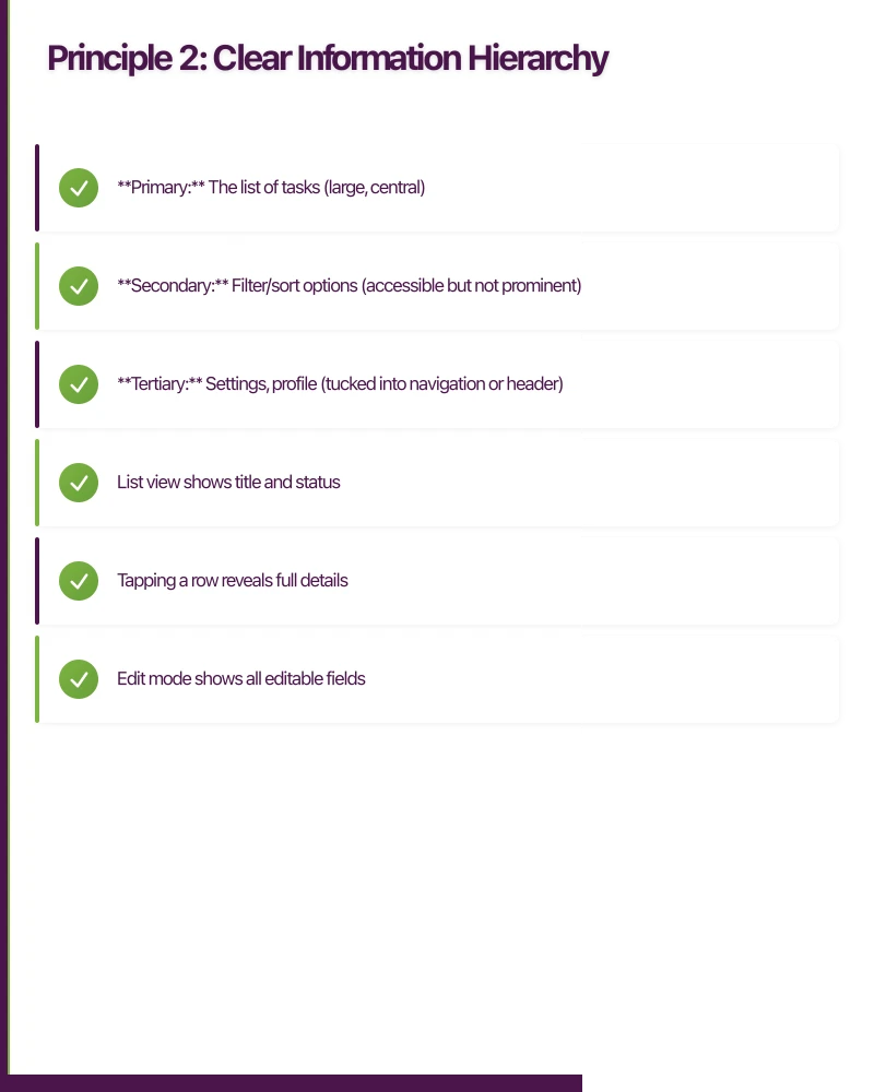
- Primary: The list of tasks (large, central)
- Secondary: Filter/sort options (accessible but not prominent)
- Tertiary: Settings, profile (tucked into navigation or header)
Progressive Disclosure
Show only the information needed at each stage. Reveal complexity gradually as users go deeper.
- List view shows title and status
- Tapping a row reveals full details
- Edit mode shows all editable fields
- Advanced options are behind a “More” or “Advanced” section
This reduces cognitive overload and keeps each screen focused.
Principle 3: Consistent Navigation
Users should always know where they are, how they got there, and how to get back. Confusion about navigation is one of the top reasons users abandon apps.
Tab Bar Navigation
Best for apps with 3 to 5 primary sections of equal importance. Each tab represents a top-level destination.
Guidelines:
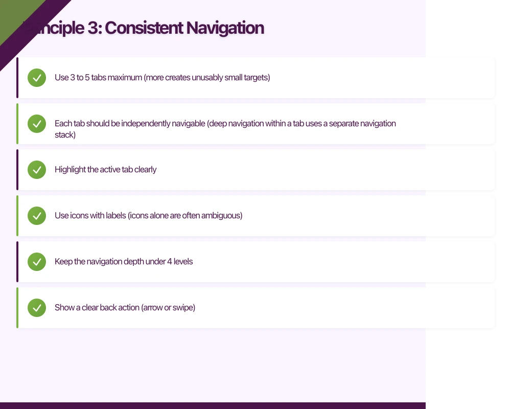
- Use 3 to 5 tabs maximum (more creates unusably small targets)
- Each tab should be independently navigable (deep navigation within a tab uses a separate navigation stack)
- Highlight the active tab clearly
- Use icons with labels (icons alone are often ambiguous)
Stack Navigation (Push/Pop)
Best for hierarchical content: list, then detail, then sub-detail. The system back button or swipe gesture returns to the previous screen.
Guidelines:
- Keep the navigation depth under 4 levels
- Show a clear back action (arrow or swipe)
- Use the navigation bar title to show current context
Drawer Navigation
A slide-out menu, typically from the left edge. Less common now than in previous years, as tab bars have proven more discoverable.
Use drawers for: Settings, account management, and secondary navigation items that do not need constant access.
Modal Presentations
Full-screen or partial overlays for focused tasks: creating new content, alerts, or multi-step forms.
Guidelines:
- Always provide a clear dismiss action (close button, cancel)
- Do not nest modals (a modal inside a modal is confusing)
- Use modals sparingly. They interrupt the user’s flow.
Principle 4: Feedback and Response
Every user action should produce visible feedback. Without feedback, users do not know if their action registered.
Types of Feedback
Visual feedback: Button press states, loading indicators, success/error states, animations.
Haptic feedback: Subtle vibrations for confirmations, errors, or selection changes. Both iOS (UIFeedbackGenerator) and Android (HapticFeedbackConstants) support this.
// Android: Haptic feedback on action
view.performHapticFeedback(HapticFeedbackConstants.CONFIRM)
Audio feedback: Rare in most apps, but useful for specific interactions (e.g., camera shutter sound, payment confirmation).
Loading States
Never show a blank screen while loading. Effective loading states are crucial for mobile app UX and directly impact mobile app performance and user experience. Options from least to most sophisticated:
- Activity indicator (spinner): Basic but clear. Use for short waits (under 3 seconds).
- Skeleton screens: Show the layout structure with placeholder shapes. Users perceive this as faster than a spinner.
- Progressive loading: Show content as it becomes available. Load text before images. Show cached data while fetching fresh data.
// SwiftUI: Simple skeleton loading
struct SkeletonRow: View {
    @State private var isAnimating = false

    var body: some View {
        HStack {
            Circle()
                .fill(Color.gray.opacity(0.3))
                .frame(width: 40, height: 40)

            VStack(alignment: .leading, spacing: 6) {
                RoundedRectangle(cornerRadius: 4)
                    .fill(Color.gray.opacity(isAnimating ? 0.3 : 0.15))
                    .frame(height: 14)
                    .frame(maxWidth: 200)

                RoundedRectangle(cornerRadius: 4)
                    .fill(Color.gray.opacity(isAnimating ? 0.3 : 0.15))
                    .frame(height: 12)
                    .frame(maxWidth: 140)
            }
        }
        .onAppear {
            withAnimation(.easeInOut(duration: 1.0).repeatForever()) {
                isAnimating = true
            }
        }
    }
}
Error States
Errors should be:
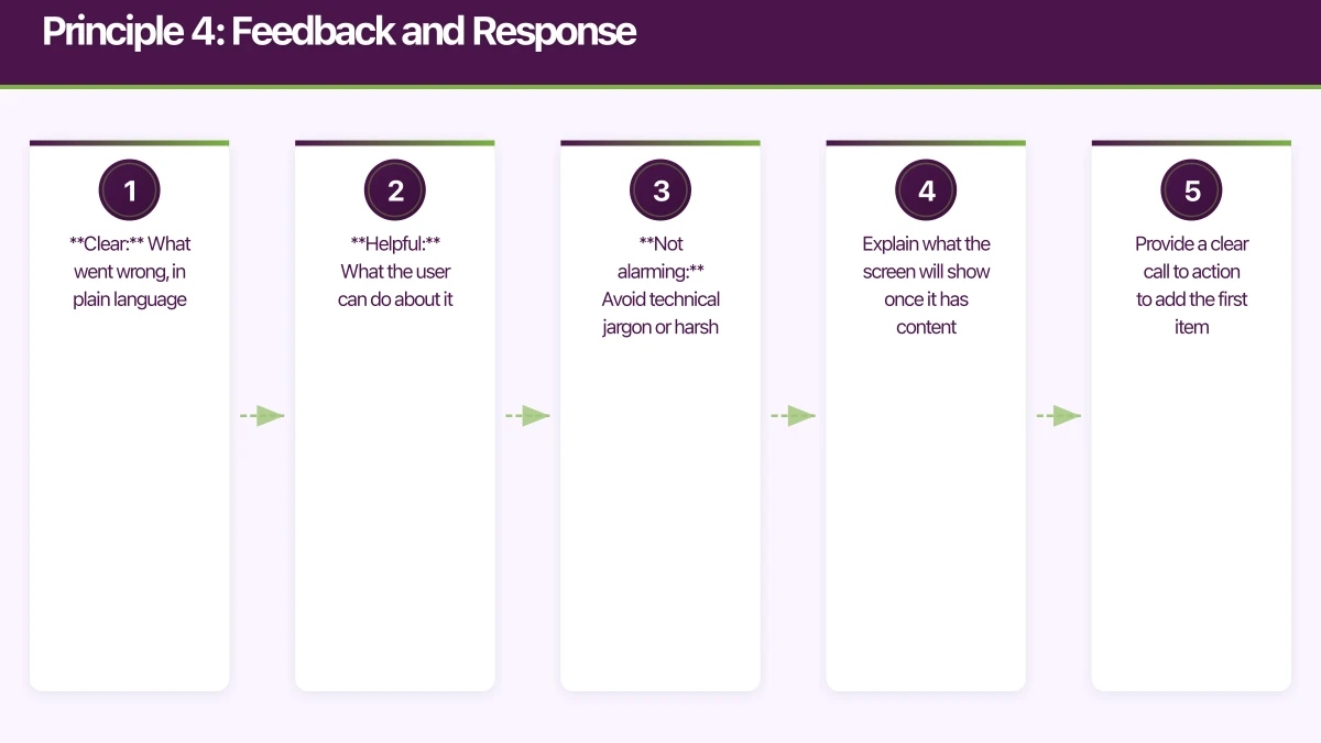
- Clear: What went wrong, in plain language
- Helpful: What the user can do about it
- Not alarming: Avoid technical jargon or harsh wording
Good: “Could not load your tasks. Check your internet connection and pull down to try again.” Bad: “Error 500: Internal Server Error”
Empty States
An empty state (no data to display) is a design opportunity, not a failure mode. This is particularly important during mobile app onboarding, where first impressions shape user retention. Use empty states to:
- Explain what the screen will show once it has content
- Provide a clear call to action to add the first item
- Maintain engagement with helpful or motivational messaging
Principle 5: Respect Platform Conventions
iOS and Android users have different expectations. Designing a single UI for both platforms leads to an experience that feels wrong on at least one of them.
Key Differences
| Element | iOS | Android |
|---|---|---|
| Back navigation | Top-left arrow or swipe from left edge | System back button/gesture |
| Primary action | Top-right of navigation bar | Floating Action Button (FAB) |
| Tab bar position | Bottom | Bottom (Material) or top |
| Alert style | Centred alert with rounded corners | Material dialog |
| Switch control | iOS toggle switch | Material switch |
| Typography | San Francisco | Roboto |
When to Diverge from Platform Conventions
It is acceptable to diverge when:
- Your brand identity requires a distinctive look (but keep interactions conventional)
- A platform convention creates UX friction in your specific use case
- You are using a cross-platform framework and perfect platform fidelity is impractical
It is not acceptable when:
- Users cannot find standard actions (back, close, save)
- Navigation patterns contradict platform norms
- Text input behaviour differs from system expectations
Principle 6: Minimise User Input
Typing on mobile is slow and error-prone. Every input field is a potential abandonment point.
Strategies to Reduce Input
Smart defaults: Pre-fill values based on context. If you know the user’s location, default to their city. If they selected a date, default the time to a reasonable value.
Auto-detection: Use the camera to scan barcodes, credit cards, or documents instead of requiring manual entry.
Selection over typing: Offer dropdowns, segmented controls, or radio buttons when the valid options are known and finite.
Auto-complete: For text inputs with predictable values (addresses, company names), provide suggestions as the user types.
Biometric authentication: Use Face ID, Touch ID, or Android biometrics for re-authentication instead of requiring passwords.
Input Field Best Practices
- Set the correct keyboard type (email, phone, URL, number)
- Enable auto-correction and auto-capitalisation where appropriate
- Show clear labels (not just placeholder text that disappears on focus)
- Support paste from clipboard
- Provide clear error messages inline, not as alerts
Principle 7: Design for Interruptions
Mobile usage is inherently interrupted. Phone calls, notifications, switching apps, and physical context changes (walking, commuting) all break the user’s attention.
Save State Automatically
Never lose user work. If a user is filling out a form and receives a phone call, the form should be intact when they return. If the app is terminated by the system, restore state on next launch.
Make Tasks Resumable
Design multi-step processes (onboarding, checkout, profile setup) so users can resume from where they left off, not start over.
Avoid Time-Sensitive Interactions
Do not require the user to complete an action within a time limit unless absolutely necessary (e.g., two-factor authentication). Users may need to put their phone down at any moment.
Principle 8: Accessibility Is Not Optional
Approximately one in five Australians has a disability. Designing for accessibility is both ethically right and commercially smart, as it expands your addressable market.
Essential Accessibility Practices
- Label all interactive elements for screen readers (VoiceOver on iOS, TalkBack on Android)
- Support Dynamic Type (iOS) and font scaling (Android) for users with low vision
- Ensure sufficient colour contrast (minimum 4.5:1 ratio for normal text, 3:1 for large text)
- Do not rely on colour alone to convey information (pair with icons, text, or patterns)
- Support keyboard/switch navigation for users who cannot use touch
- Provide captions or transcripts for audio and video content
Applying These Principles
When designing your next mobile app, use these principles as a checklist:
- Is my primary action within easy thumb reach?
- Does each screen have a clear visual hierarchy and a single primary purpose?
- Can users always tell where they are and how to go back?
- Does every action produce visible feedback?
- Does my app feel native on each platform?
- Have I minimised the amount of typing required?
- Will user work be preserved through interruptions?
- Is my app usable with assistive technologies?
These are not aspirational goals. They are the baseline for a well-designed mobile app. At eawesome, we apply these principles to every mobile project we undertake, because user experience is not a feature to add later. It is the foundation that everything else is built on.
Key Mobile App UX Statistics
Research by Steven Hoober shows that 49% of users hold their phone with one hand, making thumb-friendly design essential for mobile app UX success.
Apple recommends a minimum touch target of 44x44 points, while Google specifies 48x48 dp, ensuring users can reliably tap their intended target without frustration.
Approximately one in five Australians has a disability, making accessibility features not just ethically important but commercially vital for expanding your addressable market.
Frequently Asked Questions About Mobile App UX
What is mobile app UX and why does it matter?
Mobile app UX (user experience) refers to how users interact with and perceive a mobile application. It matters because good mobile app UX is the difference between an app users love and retain versus one they delete after a single session. Effective mobile UX design directly impacts user retention, engagement, and business outcomes.
What are the most important mobile UX design principles?
The most important mobile UX design principles include thumb-friendly design with proper touch targets (44x44 points minimum), clear information hierarchy, consistent navigation patterns, immediate feedback for user actions, respect for platform conventions (iOS vs Android), minimized user input, and comprehensive accessibility support. These principles form the foundation of successful mobile app UX.
How do iOS and Android mobile app UX differ?
iOS and Android have distinct mobile app UX conventions. iOS uses top-left back navigation and swipe gestures, while Android relies on system back buttons. iOS places primary actions in the top-right navigation bar, whereas Android uses Floating Action Buttons (FAB). Typography differs too: iOS uses San Francisco while Android uses Roboto. Effective mobile UX design respects these platform-specific patterns.
What is the ideal touch target size for mobile apps?
The ideal touch target size for mobile app UX is 44x44 points on iOS (Apple’s Human Interface Guidelines) and 48x48 dp on Android (Google’s Material Design). These sizes account for finger inaccuracy and ensure users can reliably tap interactive elements. Smaller touch targets lead to mis-taps and frustration, degrading mobile app UX.
How can I improve mobile app accessibility?
Improve mobile app UX accessibility by labeling all interactive elements for screen readers (VoiceOver on iOS, TalkBack on Android), supporting Dynamic Type and font scaling, ensuring 4.5:1 color contrast ratio minimum, not relying on color alone to convey information, supporting keyboard/switch navigation, and providing captions or transcripts for media content. With one in five Australians having a disability, accessibility expands your market while meeting ethical obligations.
A dedicated website amplifies your app’s reach. Cosmos Web Tech builds SEO-optimised sites that turn Google searches into app installs.
This article is brought to you by Ganda Tech Services — Sydney’s complete digital solutions provider covering cloud, web, and mobile.
Talk to a Sydney app developer — free.
30 minutes. We'll tell you what your app needs, how long it takes, and what it costs. Real answers, no sales pitch.
Book Free App Strategy Call →Free · 30 minutes · No obligation