Introduction
Animation transforms static interfaces into engaging, intuitive experiences. In Flutter, the animation system is both powerful and approachable, enabling developers to create smooth, 60fps animations without deep graphics programming knowledge.
Flutter’s animation framework builds on the reactive paradigm that makes the framework so productive. Animations are just values that change over time, triggering rebuilds that reflect the new state.
This guide walks through Flutter’s animation capabilities, from simple implicit animations to complex choreographed sequences.
Why Animation Matters
User Experience Benefits
Well-designed animations serve concrete purposes:
Provide Feedback When users tap a button, animation confirms the action registered. Without feedback, users wonder if the app is responding.
Guide Attention Animation draws eyes to important changes. A badge count incrementing, a new item appearing in a list, or a validation error all benefit from motion that directs focus.
Create Context Transitions between screens show spatial relationships. A detail view expanding from a list item communicates hierarchy. A slide-in drawer reveals where content lives.
Delight Users Beyond function, thoughtful animation creates emotional connection. An app that feels alive and responsive builds user trust and satisfaction.
Performance Considerations
Flutter’s architecture enables smooth animation performance:
- Compiled to native code: No JavaScript bridge overhead
- Own rendering engine: Skia provides consistent graphics
- 60fps target: Framework optimized for animation
However, poor implementation can still cause jank. We will cover performance best practices throughout this guide.
Implicit Animations
Implicit
animations are the easiest way to add motion to your app. You describe the end state, and Flutter handles the transition.
AnimatedContainer
The workhorse of implicit animations:
class ExpandingBox extends StatefulWidget {
  @override
  _ExpandingBoxState createState() => _ExpandingBoxState();
}

class _ExpandingBoxState extends State<ExpandingBox> {
  bool _expanded = false;

  @override
  Widget build(BuildContext context) {
    return GestureDetector(
      onTap: () {
        setState(() {
          _expanded = !_expanded;
        });
      },
      child: AnimatedContainer(
        duration: Duration(milliseconds: 300),
        curve: Curves.easeInOut,
        width: _expanded ? 200 : 100,
        height: _expanded ? 200 : 100,
        decoration: BoxDecoration(
          color: _expanded ? Colors.blue : Colors.red,
          borderRadius: BorderRadius.circular(_expanded ? 20 : 10),
        ),
        child: Center(
          child: Text('Tap me'),
        ),
      ),
    );
  }
}
AnimatedContainer interpolates between any properties you change: size, color, padding, margin, decoration, and more.
Other Implicit Animation Widgets
Flutter provides implicit versions of many common widgets:
AnimatedOpacity
AnimatedOpacity(
  opacity: _visible ? 1.0 : 0.0,
  duration: Duration(milliseconds: 500),
  child: Text('Fade in and out'),
)
AnimatedPadding
AnimatedPadding(
  padding: EdgeInsets.all(_expanded ? 32.0 : 8.0),
  duration: Duration(milliseconds: 200),
  child: Container(color: Colors.blue),
)
AnimatedPositioned (inside Stack)
AnimatedPositioned(
  duration: Duration(milliseconds: 300),
  left: _moved ? 100 : 0,
  top: _moved ? 100 : 0,
  child: Container(width: 50, height: 50, color: Colors.green),
)
AnimatedDefaultTextStyle
AnimatedDefaultTextStyle(
  style: _emphasized
      ? TextStyle(fontSize: 24, fontWeight: FontWeight.bold)
      : TextStyle(fontSize: 16, fontWeight: FontWeight.normal),
  duration: Duration(milliseconds: 200),
  child: Text('Animated text style'),
)
Choosing Animation Curves
The curve parameter controls the animation’s timing:
- Curves.linear: Constant speed
- Curves.easeIn: Starts slow, accelerates
- Curves.easeOut: Starts fast, decelerates
- Curves.easeInOut: Slow start and end
- Curves.bounceOut: Bouncy finish
- Curves.elasticOut: Springy overshoot
For most UI animations, Curves.easeInOut or Curves.easeOut feel natural.
Explicit Animations
When you nee
 d more control, explicit animations let you drive values directly.
AnimationController
The AnimationController orchestrates animation timing:
class PulsingCircle extends StatefulWidget {
  @override
  _PulsingCircleState createState() => _PulsingCircleState();
}

class _PulsingCircleState extends State<PulsingCircle>
    with SingleTickerProviderStateMixin {
  late AnimationController _controller;

  @override
  void initState() {
    super.initState();
    _controller = AnimationController(
      duration: Duration(seconds: 1),
      vsync: this,
    )..repeat(reverse: true);
  }

  @override
  void dispose() {
    _controller.dispose();
    super.dispose();
  }

  @override
  Widget build(BuildContext context) {
    return AnimatedBuilder(
      animation: _controller,
      builder: (context, child) {
        return Transform.scale(
          scale: 0.8 + (_controller.value * 0.4),
          child: child,
        );
      },
      child: Container(
        width: 100,
        height: 100,
        decoration: BoxDecoration(
          color: Colors.blue,
          shape: BoxShape.circle,
        ),
      ),
    );
  }
}
Key points:
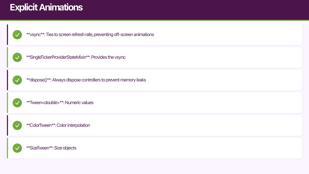
- vsync: Ties to screen refresh rate, preventing off-screen animations
- SingleTickerProviderStateMixin: Provides the vsync
- dispose(): Always dispose controllers to prevent memory leaks
Tweens
Tweens define how to interpolate between values:
class ColorFade extends StatefulWidget {
  @override
  _ColorFadeState createState() => _ColorFadeState();
}

class _ColorFadeState extends State<ColorFade>
    with SingleTickerProviderStateMixin {
  late AnimationController _controller;
  late Animation<Color?> _colorAnimation;

  @override
  void initState() {
    super.initState();
    _controller = AnimationController(
      duration: Duration(seconds: 2),
      vsync: this,
    );

    _colorAnimation = ColorTween(
      begin: Colors.red,
      end: Colors.blue,
    ).animate(_controller);

    _controller.forward();
  }

  @override
  void dispose() {
    _controller.dispose();
    super.dispose();
  }

  @override
  Widget build(BuildContext context) {
    return AnimatedBuilder(
      animation: _colorAnimation,
      builder: (context, child) {
        return Container(
          width: 100,
          height: 100,
          color: _colorAnimation.value,
        );
      },
    );
  }
}
Common Tween types:
- Tween<double>: Numeric values
- ColorTween: Color interpolation
- SizeTween: Size objects
- RectTween: Rectangle interpolation
- AlignmentTween: Alignment values
Curved Animations
Apply easing to explicit animations:
_animation = CurvedAnimation(
  parent: _controller,
  curve: Curves.easeOutBack,
);

_sizeAnimation = Tween<double>(begin: 0, end: 100).animate(_animation);
Animation States and Listeners
AnimationController provides methods and callbacks:
// Control methods
_controller.forward();   // Play forward
_controller.reverse();   // Play backward
_controller.repeat();    // Loop
_controller.stop();      // Pause
_controller.reset();     // Reset to beginning

// Status listener
_controller.addStatusListener((status) {
  if (status == AnimationStatus.completed) {
    // Animation finished
  }
});

// Value listener
_controller.addListener(() {
  // Called every frame
  print(_controller.value);
});
Hero Animations
Hero animati
ons create seamless transitions between screens by animating shared elements.
Basic Hero Usage
On the source screen:
Hero(
  tag: 'product-image-${product.id}',
  child: Image.network(product.imageUrl),
)
On the destination screen:
Hero(
  tag: 'product-image-${product.id}',
  child: Image.network(product.imageUrl),
)
The tag must match exactly. When navigating, Flutter automatically animates the widget between positions.
Customizing Hero Animations
Control the flight path:
Hero(
  tag: 'profile-avatar',
  flightShuttleBuilder: (
    BuildContext flightContext,
    Animation<double> animation,
    HeroFlightDirection flightDirection,
    BuildContext fromHeroContext,
    BuildContext toHeroContext,
  ) {
    return AnimatedBuilder(
      animation: animation,
      builder: (context, child) {
        return Material(
          color: Colors.transparent,
          child: CircleAvatar(
            radius: 24 + (animation.value * 36),
            backgroundImage: NetworkImage(avatarUrl),
          ),
        );
      },
    );
  },
  child: CircleAvatar(
    radius: 24,
    backgroundImage: NetworkImage(avatarUrl),
  ),
)
Staggered Animations
Create sequences where multiple animations play in choreographed order.
class StaggeredDemo extends StatefulWidget {
@override
_StaggeredDemoState createState() => _StaggeredDemoState();
}
class _StaggeredDemoState extends State<StaggeredDemo>
with SingleTickerProviderStateMixin {
late AnimationController _controller;
late Animation<double> _opacity;
late Animation<double> _width;
late Animation<double> _height;
late Animation<EdgeInsets> _padding;
@override
void initState() {
super.initState();
_controller = AnimationController(
duration: Duration(milliseconds: 2000),
vsync: this,
);
_opacity = Tween<double>(begin: 0.0, end: 1.0).animate(
CurvedAnimation(
parent: _controller,
curve: Interval(0.0, 0.25, curve: Curves.ease),
),
);
_width = Tween<double>(begin: 50.0, end: 150.0).animate(
CurvedAnimation(
parent: _controller,
curve: Interval(0.25, 0.5, curve: Curves.ease),
),
);
_height = Tween<double>(begin: 50.0, end: 150.0).animate(
CurvedAnimation(
parent: _controller,
curve: Interval(0.5, 0.75, curve: Curves.ease),
),
);
_padding = EdgeInsetsTween(
begin: EdgeInsets.only(bottom: 16.0),
end: EdgeInsets.only(bottom: 75.0),
).animate(
CurvedAnimation(
parent: _controller,
curve: Interval(0.75, 1.0, curve: Curves.ease),
),
);
}
@override
void dispose() {
_controller.dispose();
super.dispose();
}
@override
Widget build(BuildContext context) {
return AnimatedBuilder(
animation: _controller,
builder: (context, child) {
return Container(
padding: _padding.value,
child: Opacity(
opacity: _opacity.value,
child: Container(
width: _width.value,
height: _height.value,
color: Colors.blue,
),
),
);
},
);
}
}The Interval class defines when each animation plays within the overall duration.
List Animations
Animating list items enhances perceived performance and provides visual context.
AnimatedList
For lists that change over time:
class AnimatedListDemo extends StatefulWidget {
@override
_AnimatedListDemoState createState() => _AnimatedListDemoState();
}
class _AnimatedListDemoState extends State<AnimatedListDemo> {
final GlobalKey<AnimatedListState> _listKey = GlobalKey<AnimatedListState>();
final List<String> _items = [];
void _addItem() {
final index = _items.length;
_items.add('Item ${index + 1}');
_listKey.currentState?.insertItem(index);
}
void _removeItem(int index) {
final removedItem = _items.removeAt(index);
_listKey.currentState?.removeItem(
index,
(context, animation) => _buildItem(removedItem, animation),
);
}
Widget _buildItem(String item, Animation<double> animation) {
return SizeTransition(
sizeFactor: animation,
child: Card(
child: ListTile(
title: Text(item),
),
),
);
}
@override
Widget build(BuildContext context) {
return Column(
children: [
ElevatedButton(
onPressed: _addItem,
child: Text('Add Item'),
),
Expanded(
child: AnimatedList(
key: _listKey,
initialItemCount: _items.length,
itemBuilder: (context, index, animation) {
return _buildItem(_items[index], animation);
},
),
),
],
);
}
}Staggered List Item Animations
Animate list items with delays for a cascade effect:
class StaggeredListView extends StatefulWidget {
final List<Widget> children;
StaggeredListView({required this.children});
@override
_StaggeredListViewState createState() => _StaggeredListViewState();
}
class _StaggeredListViewState extends State<StaggeredListView>
with SingleTickerProviderStateMixin {
late AnimationController _controller;
@override
void initState() {
super.initState();
_controller = AnimationController(
duration: Duration(milliseconds: 800),
vsync: this,
);
_controller.forward();
}
@override
void dispose() {
_controller.dispose();
super.dispose();
}
@override
Widget build(BuildContext context) {
return ListView.builder(
itemCount: widget.children.length,
itemBuilder: (context, index) {
final animation = Tween<double>(begin: 0.0, end: 1.0).animate(
CurvedAnimation(
parent: _controller,
curve: Interval(
index * 0.1,
(index * 0.1) + 0.3,
curve: Curves.easeOut,
),
),
);
return AnimatedBuilder(
animation: animation,
builder: (context, child) {
return Transform.translate(
offset: Offset(0, 50 * (1 - animation.value)),
child: Opacity(
opacity: animation.value,
child: child,
),
);
},
child: widget.children[index],
);
},
);
}
}Physics-Based Animations
Spring physics create natural-feeling motion.
class SpringAnimation extends StatefulWidget {
@override
_SpringAnimationState createState() => _SpringAnimationState();
}
class _SpringAnimationState extends State<SpringAnimation>
with SingleTickerProviderStateMixin {
late AnimationController _controller;
late Animation<Offset> _animation;
@override
void initState() {
super.initState();
_controller = AnimationController(
vsync: this,
duration: Duration(seconds: 1),
);
_animation = _controller.drive(
Tween<Offset>(
begin: Offset.zero,
end: Offset(100, 0),
),
);
}
void _runAnimation() {
_controller.animateWith(
SpringSimulation(
SpringDescription(
mass: 1,
stiffness: 100,
damping: 10,
),
0, // starting position
1, // ending position
0, // starting velocity
),
);
}
@override
Widget build(BuildContext context) {
return GestureDetector(
onTap: _runAnimation,
child: AnimatedBuilder(
animation: _animation,
builder: (context, child) {
return Transform.translate(
offset: _animation.value,
child: Container(
width: 50,
height: 50,
color: Colors.blue,
),
);
},
),
);
}
}Adjust spring parameters:
- mass: Higher mass = slower, more momentum
- stiffness: Higher stiffness = faster snap
- damping: Higher damping = less bounce
Performance Best Practices
Use RepaintBoundary
Isolate animated widgets to prevent unnecessary repaints:
RepaintBoundary(
  child: AnimatedWidget(...),
)
Leverage Child Property
AnimatedBuilder accepts a child parameter for non-animated content:
AnimatedBuilder(
  animation: _controller,
  builder: (context, child) {
    return Transform.rotate(
      angle: _controller.value * 2 * pi,
      child: child,  // Reused, not rebuilt
    );
  },
  child: ExpensiveWidget(),  // Built once
)
Avoid Opacity on Complex Widgets
Opacity on large subtrees is expensive. Consider alternatives:
- FadeTransition with opacity animation
- Color animation instead of opacity
- Visibility widget for show/hide
Profile Animation Performance
Use Flutter DevTools to identify jank:
- Run app in profile mode:
flutter run --profile - Open DevTools
- Navigate to Performance tab
- Record during animations
- Look for frames exceeding 16ms
Conclusion
Flutter’s animation system provides tools for every level of complexity. Start with implicit animations for simple state transitions. Progress to explicit animations when you need precise control. Use Hero animations for seamless navigation. Apply physics for natural motion.
The key to great animation is restraint. Animate with purpose, not for decoration. Every animation should serve user understanding or delight. Test animations on real devices across performance levels to ensure smooth experiences for all users.
As you build more Flutter apps, you will develop intuition for when and how to animate. The framework makes experimentation easy, so try different approaches and observe how they feel in practice.
Building a Flutter app that needs polished animations? The Awesome Apps team creates engaging mobile experiences with beautiful, performant motion design. Contact us to discuss your project.
Scaling your app’s backend? Cloud Geeks specialises in cloud infrastructure that grows with your user base across Australia.
Awesome Apps operates under the Ganda Tech Services umbrella, delivering end-to-end technology solutions for Australian businesses.
Talk to a Sydney app developer — free.
30 minutes. We'll tell you what your app needs, how long it takes, and what it costs. Real answers, no sales pitch.
Book Free App Strategy Call →Free · 30 minutes · No obligation