Flutter Animations: Building Delightful User Experiences
Animations are the difference between an app that feels mechanical and one that feels alive. A button that snaps to its pressed state feels broken. A button that smoothly transitions with a subtle scale and colour change feels intentional. Flutter’s animation system is one of its greatest strengths — it runs at 60fps (or 120fps on supported devices) and provides multiple abstraction levels to match your needs.
This guide covers practical animation patterns from simple implicit animations to complex choreographed sequences, with a focus on building animations that enhance usability rather than just looking impressive.
The Animation Hierarchy
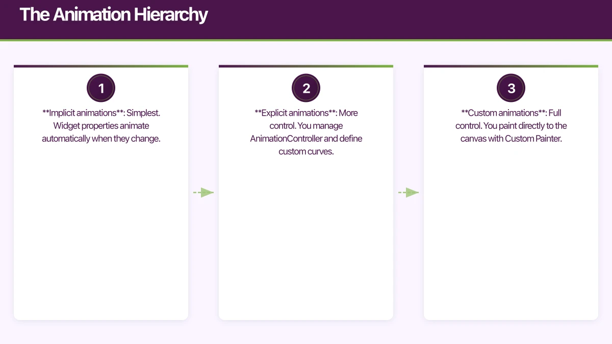
Flutter offers three levels of animation abstraction:
- Implicit animations: Simplest. Widget properties animate automatically when they change.
- Explicit animations: More control. You manage AnimationController and define custom curves.
- Custom animations: Full control. You paint directly to the canvas with Custom Painter.
Start with implicit animations and only move to explicit when you need more control. Most production animations fall into the first two categories.
Implicit Animation
 s
s
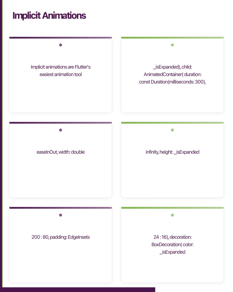
Implicit animations are Flutter’s easiest animation tool. Wrap a value change in an AnimatedFoo widget and Flutter handles the rest:
AnimatedContainer
class ExpandableCard extends StatefulWidget {
  @override
  State<ExpandableCard> createState() => _ExpandableCardState();
}

class _ExpandableCardState extends State<ExpandableCard> {
  bool _isExpanded = false;

  @override
  Widget build(BuildContext context) {
    return GestureDetector(
      onTap: () => setState(() => _isExpanded = !_isExpanded),
      child: AnimatedContainer(
        duration: const Duration(milliseconds: 300),
        curve: Curves.easeInOut,
        width: double.infinity,
        height: _isExpanded ? 200 : 80,
        padding: EdgeInsets.all(_isExpanded ? 24 : 16),
        decoration: BoxDecoration(
          color: _isExpanded
              ? Theme.of(context).colorScheme.primaryContainer
              : Theme.of(context).colorScheme.surface,
          borderRadius: BorderRadius.circular(_isExpanded ? 16 : 8),
          boxShadow: [
            BoxShadow(
              color: Colors.black.withOpacity(_isExpanded ? 0.15 : 0.05),
              blurRadius: _isExpanded ? 12 : 4,
              offset: Offset(0, _isExpanded ? 6 : 2),
            ),
          ],
        ),
        child: Column(
          crossAxisAlignment: CrossAxisAlignment.start,
          children: [
            Text(
              'Product Name',
              style: Theme.of(context).textTheme.titleMedium,
            ),
            if (_isExpanded) ...[
              const SizedBox(height: 12),
              AnimatedOpacity(
                duration: const Duration(milliseconds: 200),
                opacity: _isExpanded ? 1.0 : 0.0,
                child: Text(
                  'Full product description that appears when the card is expanded.',
                  style: Theme.of(context).textTheme.bodyMedium,
                ),
              ),
            ],
          ],
        ),
      ),
    );
  }
}
AnimatedSwitcher
Perfect for transitioning between different widgets:
class StatusIndicator extends StatelessWidget {
  final OrderStatus status;

  const StatusIndicator({required this.status});

  @override
  Widget build(BuildContext context) {
    return AnimatedSwitcher(
      duration: const Duration(milliseconds: 300),
      transitionBuilder: (child, animation) {
        return FadeTransition(
          opacity: animation,
          child: SlideTransition(
            position: Tween<Offset>(
              begin: const Offset(0, 0.3),
              end: Offset.zero,
            ).animate(animation),
            child: child,
          ),
        );
      },
      child: _buildStatusChip(status),
    );
  }

  Widget _buildStatusChip(OrderStatus status) {
    return Chip(
      key: ValueKey(status), // Important: unique key triggers animation
      label: Text(status.label),
      backgroundColor: status.color,
    );
  }
}
TweenAnimationBuilder
For custom implicit animations without creating a StatefulWidget:
class PulsingDot extends StatelessWidget {
  final bool isActive;

  const PulsingDot({required this.isActive});

  @override
  Widget build(BuildContext context) {
    return TweenAnimationBuilder<double>(
      tween: Tween(begin: 0.0, end: isActive ? 1.0 : 0.0),
      duration: const Duration(milliseconds: 500),
      curve: Curves.easeOut,
      builder: (context, value, child) {
        return Container(
          width: 12 + (value * 4),
          height: 12 + (value * 4),
          decoration: BoxDecoration(
            shape: BoxShape.circle,
            color: Color.lerp(Colors.grey, Colors.green, value),
            boxShadow: [
              BoxShadow(
                color: Colors.green.withOpacity(value * 0.4),
                blurRadius: value * 8,
              ),
            ],
          ),
        );
      },
    );
  }
}
Explicit Animations
When you need precise control over timing, sequencing, or looping, use explicit animations with AnimationController:
Loading Animation
class LoadingIndicator extends StatefulWidget {
@override
State<LoadingIndicator> createState() => _LoadingIndicatorState();
}
class _LoadingIndicatorState extends State<LoadingIndicator>
with SingleTickerProviderStateMixin {
late AnimationController _controller;
late Animation<double> _scaleAnimation;
late Animation<double> _opacityAnimation;
@override
void initState() {
super.initState();
_controller = AnimationController(
duration: const Duration(milliseconds: 1200),
vsync: this,
)..repeat(reverse: true);
_scaleAnimation = Tween<double>(begin: 0.8, end: 1.2).animate(
CurvedAnimation(parent: _controller, curve: Curves.easeInOut),
);
_opacityAnimation = Tween<double>(begin: 0.4, end: 1.0).animate(
CurvedAnimation(parent: _controller, curve: Curves.easeInOut),
);
}
@override
void dispose() {
_controller.dispose();
super.dispose();
}
@override
Widget build(BuildContext context) {
return AnimatedBuilder(
animation: _controller,
builder: (context, child) {
return Transform.scale(
scale: _scaleAnimation.value,
child: Opacity(
opacity: _opacityAnimation.value,
child: child,
),
);
},
child: const Icon(Icons.refresh, size: 48),
);
}
}Staggered Animations
Create choreographed sequences where elements animate in sequence:
class StaggeredList extends StatefulWidget {
final List<String> items;
const StaggeredList({required this.items});
@override
State<StaggeredList> createState() => _StaggeredListState();
}
class _StaggeredListState extends State<StaggeredList>
with SingleTickerProviderStateMixin {
late AnimationController _controller;
@override
void initState() {
super.initState();
_controller = AnimationController(
duration: Duration(milliseconds: 200 * widget.items.length),
vsync: this,
)..forward();
}
@override
void dispose() {
_controller.dispose();
super.dispose();
}
@override
Widget build(BuildContext context) {
return ListView.builder(
itemCount: widget.items.length,
itemBuilder: (context, index) {
final startInterval = index / widget.items.length;
final endInterval = (index + 1) / widget.items.length;
final slideAnimation = Tween<Offset>(
begin: const Offset(1, 0),
end: Offset.zero,
).animate(
CurvedAnimation(
parent: _controller,
curve: Interval(startInterval, endInterval, curve: Curves.easeOut),
),
);
final fadeAnimation = Tween<double>(begin: 0, end: 1).animate(
CurvedAnimation(
parent: _controller,
curve: Interval(startInterval, endInterval),
),
);
return SlideTransition(
position: slideAnimation,
child: FadeTransition(
opacity: fadeAnimation,
child: ListTile(title: Text(widget.items[index])),
),
);
},
);
}
}Hero Animations
Hero animations create a visual connection between screens by animating a shared element:
// Source screen
class ProductGrid extends StatelessWidget {
  @override
  Widget build(BuildContext context) {
    return GridView.builder(
      gridDelegate: const SliverGridDelegateWithFixedCrossAxisCount(
        crossAxisCount: 2,
      ),
      itemBuilder: (context, index) {
        final product = products[index];
        return GestureDetector(
          onTap: () {
            Navigator.push(
              context,
              MaterialPageRoute(
                builder: (_) => ProductDetailScreen(product: product),
              ),
            );
          },
          child: Hero(
            tag: 'product-image-${product.id}',
            child: ClipRRect(
              borderRadius: BorderRadius.circular(8),
              child: Image.network(product.imageUrl, fit: BoxFit.cover),
            ),
          ),
        );
      },
    );
  }
}

// Destination screen
class ProductDetailScreen extends StatelessWidget {
  final Product product;

  const ProductDetailScreen({required this.product});

  @override
  Widget build(BuildContext context) {
    return Scaffold(
      body: CustomScrollView(
        slivers: [
          SliverAppBar(
            expandedHeight: 300,
            flexibleSpace: FlexibleSpaceBar(
              background: Hero(
                tag: 'product-image-${product.id}',
                child: Image.network(
                  product.imageUrl,
                  fit: BoxFit.cover,
                ),
              ),
            ),
          ),
          SliverToBoxAdapter(
            child: Padding(
              padding: const EdgeInsets.all(16),
              child: Column(
                crossAxisAlignment: CrossAxisAlignment.start,
                children: [
                  Text(product.name,
                      style: Theme.of(context).textTheme.headlineMedium),
                  const SizedBox(height: 8),
                  Text('\$${product.price.toStringAsFixed(2)}',
                      style: Theme.of(context).textTheme.titleLarge),
                ],
              ),
            ),
          ),
        ],
      ),
    );
  }
}
Micro-Interactions
Small animations that provide feedback and delight:
Like Button Animation
class AnimatedLikeButton extends StatefulWidget {
  final bool isLiked;
  final VoidCallback onTap;

  const AnimatedLikeButton({required this.isLiked, required this.onTap});

  @override
  State<AnimatedLikeButton> createState() => _AnimatedLikeButtonState();
}

class _AnimatedLikeButtonState extends State<AnimatedLikeButton>
    with SingleTickerProviderStateMixin {
  late AnimationController _controller;

  @override
  void initState() {
    super.initState();
    _controller = AnimationController(
      duration: const Duration(milliseconds: 300),
      vsync: this,
    );
  }

  @override
  void didUpdateWidget(AnimatedLikeButton oldWidget) {
    super.didUpdateWidget(oldWidget);
    if (widget.isLiked && !oldWidget.isLiked) {
      _controller.forward(from: 0);
    }
  }

  @override
  void dispose() {
    _controller.dispose();
    super.dispose();
  }

  @override
  Widget build(BuildContext context) {
    return GestureDetector(
      onTap: widget.onTap,
      child: AnimatedBuilder(
        animation: _controller,
        builder: (context, child) {
          final scale = 1.0 + (_controller.value * 0.3) *
              (1.0 - _controller.value); // Bounce effect

          return Transform.scale(
            scale: scale,
            child: Icon(
              widget.isLiked ? Icons.favorite : Icons.favorite_border,
              color: widget.isLiked ? Colors.red : Colors.grey,
              size: 28,
            ),
          );
        },
      ),
    );
  }
}
Performance Optimisation
Use RepaintBoundary
Isolate animated widgets to prevent unnecessary repaints of the entire widget tree:
RepaintBoundary(
  child: AnimatedWidget(/* ... */),
)
Avoid Animating Layout Properties
Animating width, height, padding, or margin triggers layout recalculation every frame. Prefer animating Transform, Opacity, and ClipRect which only affect the paint phase:
// Prefer: transform-based animation (paint only)
Transform.scale(
  scale: _animation.value,
  child: myWidget,
)

// Avoid: size-based animation (triggers layout)
SizedBox(
  width: _animation.value * 200,
  child: myWidget,
)
Use const Widgets
Children of animated builders that do not change should be const to avoid rebuilds:
AnimatedBuilder(
  animation: _controller,
  builder: (context, child) {
    return Transform.rotate(
      angle: _controller.value * 2 * pi,
      child: child, // Reused, not rebuilt
    );
  },
  child: const Icon(Icons.refresh, size: 48), // Built once
)
Animation Principles for Mobile
-
Duration matters. Most UI animations should be 200-400ms. Shorter feels snappy, longer feels smooth. Anything over 500ms feels sluggish.
-
Use appropriate curves.
easeOutfor elements entering the screen (fast start, gentle stop).easeInfor elements leaving.easeInOutfor state changes. -
Animate with purpose. Every animation should communicate something: state change, spatial relationship, or feedback. Decorative animations distract.
-
Respect reduced motion. Some users have vestibular disorders. Check
MediaQuery.of(context).disableAnimationsand provide static alternatives. -
Test on real devices. Animations that run smoothly on a flagship phone may stutter on budget devices. Always test your minimum supported hardware.
Well-crafted animations make your app feel polished and professional. They guide users, provide feedback, and create a sense of quality that distinguishes great apps from good ones.
Building a Flutter app with polished animations? Our team at eawesome creates beautiful, performant mobile experiences.
For a strategic perspective on how mobile fits into your broader digital transformation, read Ash Ganda’s insights on technology strategy.
Awesome Apps is the mobile development division of Ganda Tech Services, building iOS and Android apps for Australian businesses.
Talk to a Sydney app developer — free.
30 minutes. We'll tell you what your app needs, how long it takes, and what it costs. Real answers, no sales pitch.
Book Free App Strategy Call →Free · 30 minutes · No obligation