Mobile App Prototyping Tools and Workflow Guide
Building the wrong thing is the most expensive mistake in app development. Prototyping lets you validate ideas, test user flows, and gather feedback before committing to code. A week of prototyping can save months of development time.
This guide covers the tools, techniques, and workflows for effective mobile app prototyping in 2021. Whether you are a designer, developer, or founder, understanding prototyping will make your app better and your development process more efficient.
Why Prototype Before You Build
Prototyping is not about making things look pretty. It is about answering questions:
- Does the core user flow make sense?
- Can users accomplish their primary task without confusion?
- Is the information architecture intuitive?
- What do users expect to happen when they tap this button?
- Which of two design approaches works better?
A prototype answers these questions in days instead of weeks. Changes to a prototype cost minutes. Changes to production code cost hours or days.
Prototyping Fidelity Levels
Low fidelity (paper or wireframes): Simple sketches showing layout and flow. Quick to create, ideal for early exploration. No visual design, no interactions.
Medium fidelity (interactive wireframes): Clickable screens with basic navigation. Tests flow and information architecture. Minimal visual design.
High fidelity (polished interactive): Near-production visual design with realistic interactions and animations. Tests the complete experience. Used for stakeholder approval and detailed user testing.
Start low and increase fidelity as your confidence in the design grows. Jumping straight to high fidelity wastes time if the underlying flow is wrong.
Prototyping Tools
 Compared
Figma
Best for: Teams, collaboration, cross-platform design, most mobile app projects
Figma has become the dominant design tool for mobile apps, and for good reason. It runs in the browser (with a desktop app available), enables real-time collaboration, and includes robust prototyping features.
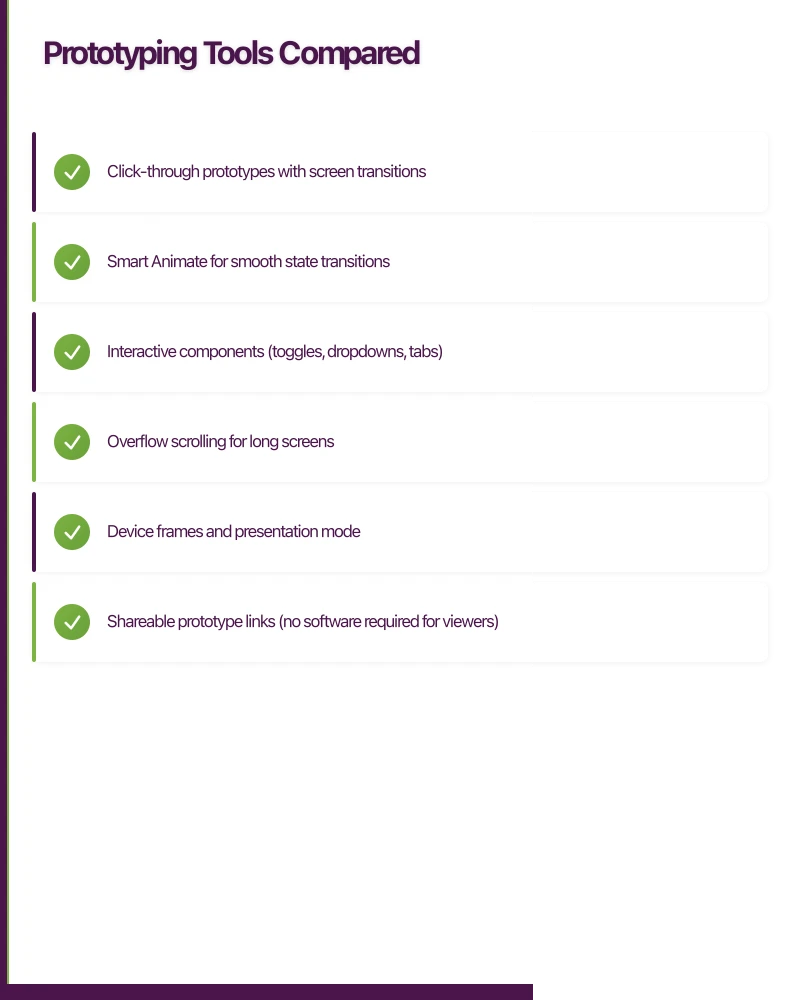
Prototyping capabilities:
- Click-through prototypes with screen transitions
- Smart Animate for smooth state transitions
- Interactive components (toggles, dropdowns, tabs)
- Overflow scrolling for long screens
- Device frames and presentation mode
- Shareable prototype links (no software required for viewers)
Strengths:
- Real-time collaboration (multiple designers working simultaneously)
- Free for individuals (up to 3 projects)
- Browser-based (works on any OS)
- Extensive plugin ecosystem
- Community files and design systems (Material Design, iOS components)
- Version history and branching
Limitations:
- Offline access requires the desktop app
- Complex animations are limited (no physics-based animations)
- Performance can degrade with very large files
Pricing:
- Starter: Free (up to 3 Figma files)
- Professional: USD 12/editor/month
- Organisation: USD 45/editor/month
Sketch
Best for: Solo designers on macOS, teams with established Sketch workflows
Sketch was the industry standard before Figma’s rise. It remains a capable tool, particularly for designers who prefer a native macOS experience.
Prototyping capabilities:
- Basic click-through prototypes
- Limited transitions and animations
- Requires Sketch Cloud or third-party tools (InVision, Marvel) for sharing
Strengths:
- Native macOS app (snappy performance)
- Mature plugin ecosystem
- Strong symbol and component system
- Extensive third-party integration
Limitations:
- macOS only
- No real-time collaboration (Sketch for Teams added some features but lags Figma)
- Prototyping is basic; most teams use a separate tool
- Paid only (no free tier beyond trial)
Pricing: USD 9/editor/month (Sketch for Teams) or USD 99 one-time (individual)
Adobe XD
Best for: Teams using other Adobe products, designers who want built-in prototyping
Adobe XD positions itself as an all-in-one design and prototyping tool. It has improved significantly since launch and competes well on features.
Prototyping capabilities:
- Click-through prototypes with transitions
- Auto-Animate for smooth state transitions
- Voice prototyping (triggers based on voice commands)
- Timer-based transitions
- Drag interactions
- 3D transforms
Strengths:
- Tighter integration with Adobe Creative Cloud
- Auto-Animate creates smooth transitions automatically
- Voice prototyping is unique
- Free starter plan
- Cross-platform (macOS and Windows)
Limitations:
- Smaller community than Figma
- Plugin ecosystem is less mature
- Collaboration features lag behind Figma
- Adobe licensing can be confusing
Pricing:
- Starter: Free (limited features)
- Single App: USD 9.99/month
- Creative Cloud: USD 52.99/month (all Adobe apps)
Recommendation
For most teams in 2021: Use Figma. The combination of browser-based access, real-time collaboration, built-in prototyping, and generous free tier makes it the clear winner. The only reason to choose otherwise is if your team is deeply invested in Sketch workflows or the broader Adobe ecosystem.
The Prototyping
 Workflow
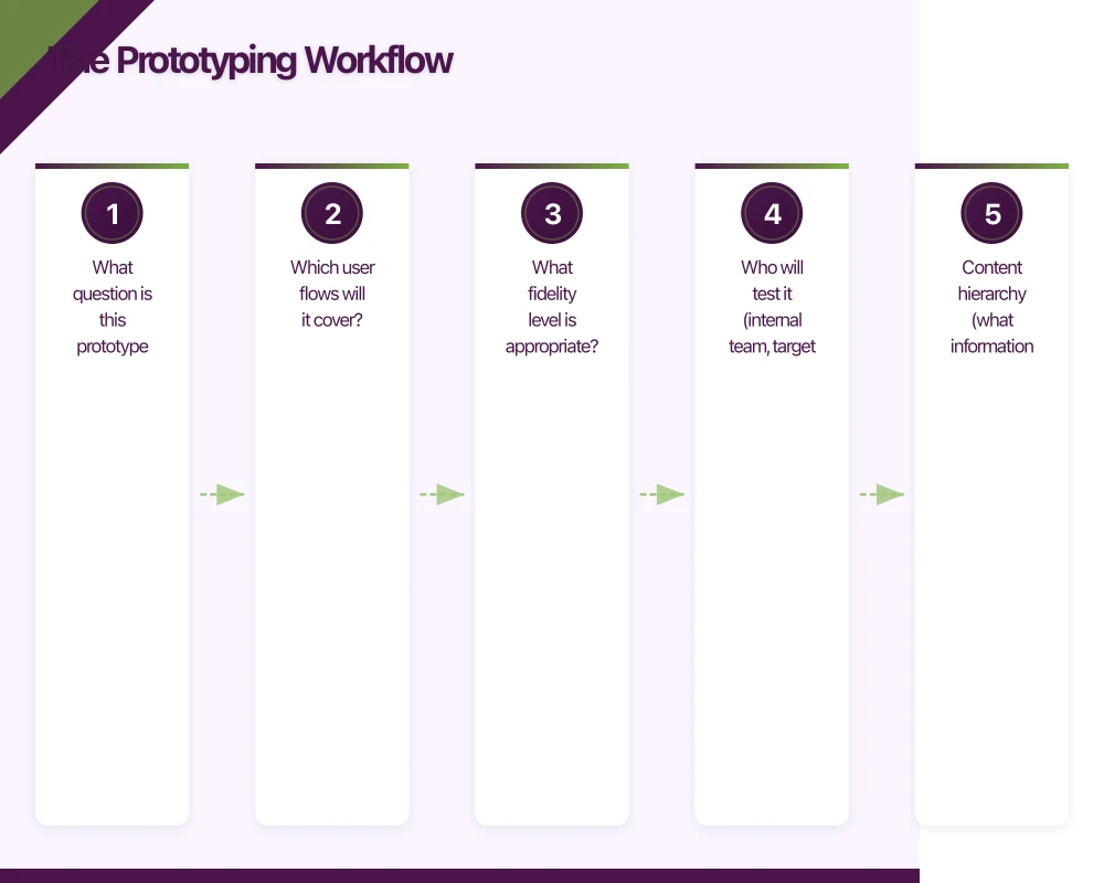
Step 1: Define the Scope
Before opening any tool, answer:
- What question is this prototype trying to answer?
- Which user flows will it cover?
- What fidelity level is appropriate?
- Who will test it (internal team, target users, stakeholders)?
Write these down. A prototype without a clear purpose becomes a time sink.
Step 2: Map User Flows
Sketch the complete user flow before designing any screens. Use a whiteboard, paper, or a flowcharting tool:
[App Open]
  |
  v
[Has Account?] -- No */} [Onboarding] */} [Sign Up] */} [Home]
  |
  Yes
  |
  v
[Home Screen]
  |
  +-- [Tab: Projects] */} [Project List] */} [Project Detail] */} [Task Detail]
  |
  +-- [Tab: Create] */} [New Project Form] */} [Project Created]
  |
  +-- [Tab: Profile] */} [Settings] */} [Edit Profile]
This flow becomes your prototype’s skeleton.
Step 3: Create Wireframes
Design each screen at low to medium fidelity. Focus on:
- Content hierarchy (what information goes where)
- Navigation structure (how screens connect)
- Key interaction points (buttons, forms, gestures)
Use Figma’s wireframe components or a kit like Wireframy to speed this up.
Step 4: Add Interactions
Connect screens with interactions in your prototyping tool:
In Figma:
- Select the interactive element (button, card, etc.)
- Switch to the Prototype tab
- Drag the connection to the destination screen
- Choose the transition type (push, slide, dissolve)
- Set the animation duration (200 to 300ms for most transitions)
Key interactions to prototype:
- Primary navigation (tabs, back buttons)
- Core user actions (create, edit, delete)
- Form submissions with success/error states
- Loading states (skeleton screens)
- Empty states (no content yet)
- Pull-to-refresh and infinite scroll
Step 5: Test with Users
The purpose of a prototype is to test with real people. Here is how:
Recruit 5 users. Five users find approximately 85 percent of usability issues (Jakob Nielsen’s research). They should match your target audience.
Write test tasks, not instructions. Say “Find a way to create a new project” not “Tap the plus button in the bottom right corner.”
Observe silently. Let the user figure things out. Note where they hesitate, make wrong taps, or express confusion. Do not help unless they are completely stuck.
Ask follow-up questions:
- “What did you expect to happen when you tapped that?”
- “Is there anything you wanted to do but could not find?”
- “How would you describe what this app does to a friend?”
Tools for remote testing:
- Figma’s built-in presentation mode (share the prototype link)
- Maze (integrates with Figma for unmoderated testing)
- Lookback (screen recording with face cam)
- UserTesting (professional panel recruitment)
Step 6: Iterate
After testing, categorise findings:
Critical: Users cannot complete the primary task. Fix immediately. Major: Users are confused but eventually succeed. Fix before development. Minor: Small friction points. Note for future improvement.
Update the prototype, test again if critical issues were found, and proceed to development when the core flow tests well.
Prototyping Techniq
 ues for Mobile
Component-Based Design
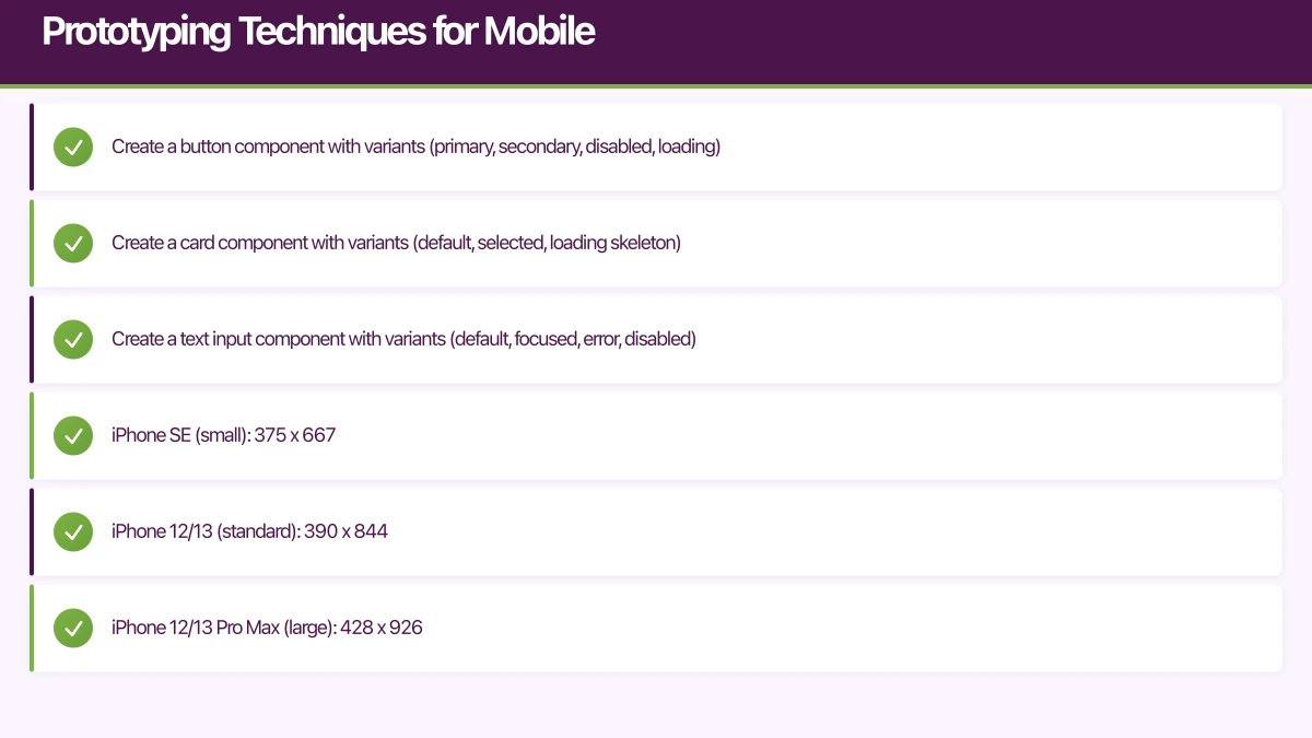
Build your prototype from reusable components. In Figma, use components and variants:
- Create a button component with variants (primary, secondary, disabled, loading)
- Create a card component with variants (default, selected, loading skeleton)
- Create a text input component with variants (default, focused, error, disabled)
Changes to the main component propagate to all instances, keeping your prototype consistent.
Responsive Prototyping
Design for multiple screen sizes:
- iPhone SE (small): 375 x 667
- iPhone 12/13 (standard): 390 x 844
- iPhone 12/13 Pro Max (large): 428 x 926
- Samsung Galaxy S21 (Android): 360 x 800
- Pixel 5 (Android): 393 x 851
Use Figma’s Auto Layout to create components that adapt to content, reducing the need for separate designs per screen size.
Animation and Micro-interactions
Subtle animations make prototypes feel real:
- Screen transitions: Slide, push, or dissolve between screens (200 to 300ms)
- State changes: Animate between component states using Smart Animate
- Loading indicators: Show skeleton screens or spinners during simulated loading
- Feedback: Button press effects, checkmark animations on completion
Keep animations functional, not decorative. Every animation should communicate something (direction, progress, confirmation).
Prototyping Gestures
Mobile apps rely on gestures that desktop prototyping tools handle differently:
- Swipe to delete: Create a frame showing the delete action revealed
- Pull to refresh: Show the refresh indicator state
- Long press: Use timed triggers (in Adobe XD) or overlay states
- Pinch to zoom: Difficult to prototype accurately; consider skipping or using a video mockup
From Prototype to Development
Design Handoff
When your prototype is approved, hand it off to developers with:
-
Figma link with inspect access: Developers can inspect spacing, colours, fonts, and export assets directly from Figma.
-
Documented interactions: List every interaction, transition, and animation with specifications (duration, easing curve, trigger).
-
Edge cases: Document what happens with very long text, empty states, error states, and loading states. These are commonly missed in prototypes but must be built.
-
Asset export: Mark icons and images as exportable in your design file. Specify formats (SVG for icons, PNG/WebP for images) and sizes (1x, 2x, 3x for iOS; mdpi through xxxhdpi for Android).
Developer Preview
Tools like Figma’s inspect mode and Zeplin bridge the gap between design and development:
- Colours mapped to your design system tokens
- Spacing and sizing in points/dp
- Typography specs (font, size, weight, line height)
- Auto-generated CSS/SwiftUI/Compose code snippets (approximate, not production-ready)
Prototyping Checklist
Before declaring your prototype ready for testing:
- All primary user flows are interactive
- Back navigation works on every screen
- Loading states are shown where network requests would occur
- Empty states are designed for first-time use
- Error states are included for form submissions
- Text is realistic (not lorem ipsum)
- Touch targets are at least 44x44 points
- The prototype works on an actual mobile device (not just desktop preview)
Getting Started
If you are new to prototyping:
- Sign up for Figma (free)
- Download a mobile UI kit (iOS or Material Design)
- Map your app’s primary user flow on paper
- Build 5 to 10 screens covering that flow
- Connect them with basic interactions
- Test with 3 people and take notes
You will be surprised how much you learn in a single afternoon of prototyping and testing. At eawesome, prototyping is the first step in every project, because building the right thing is more important than building the thing right.
Need a web version of your mobile app? Cosmos Web Tech builds responsive web apps and PWAs for Australian businesses.
This article is brought to you by Ganda Tech Services — Sydney’s complete digital solutions provider covering cloud, web, and mobile.
Talk to a Sydney app developer — free.
30 minutes. We'll tell you what your app needs, how long it takes, and what it costs. Real answers, no sales pitch.
Book Free App Strategy Call →Free · 30 minutes · No obligation