Mobile App Theming and Dynamic Styling Systems
A well-designed theming system is invisible to users but transformative for development teams. It ensures visual consistency across hundreds of screens, enables dark mode with a single toggle, supports accessibility requirements, and makes brand updates trivial rather than traumatic.
Yet most mobile apps treat theming as an afterthought — colours scattered through view files, font sizes hardcoded in layouts, spacing values duplicated everywhere. When the design team says “let us update our primary colour,” the engineering team estimates three weeks of work.
This guide covers how to build a proper theming system that scales with your app and adapts to user preferences.
Design Token Architecture
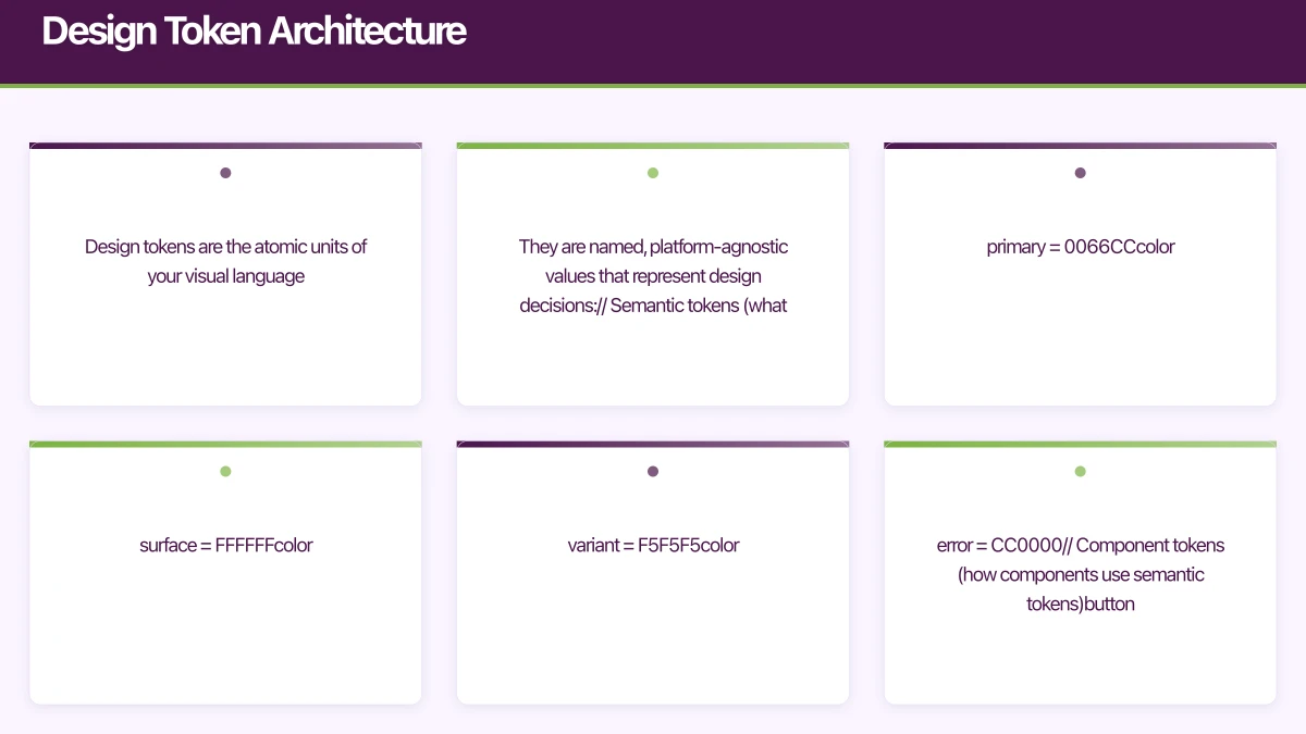
Design tokens are the atomic units of your visual language. They are named, platform-agnostic values that represent design decisions:
// Semantic tokens (what the colour means)
color.primary = #0066CC
color.primary.on = #FFFFFF
color.surface = #FFFFFF
color.surface.variant = #F5F5F5
color.error = #CC0000

// Component tokens (how components use semantic tokens)
button.primary.background = color.primary
button.primary.text = color.primary.on
card.background = color.surface
card.border = color.surface.variant

// Spacing tokens
spacing.xs = 4
spacing.sm = 8
spacing.md = 16
spacing.lg = 24
spacing.xl = 32

// Typography tokens
font.heading.large = 28sp bold
font.heading.medium = 22sp semibold
font.body.regular = 16sp regular
font.body.small = 14sp regular
font.caption = 12sp regular
The key insight is the three-tier hierarchy: primitive values (raw colours, numbers) feed into semantic tokens (what the value means), which feed into component tokens (how components consume them).
iOS Theming with SwiftUI
Building the Theme System
// Define the theme protocol
protocol AppTheme {
    var colors: ThemeColors { get }
    var typography: ThemeTypography { get }
    var spacing: ThemeSpacing { get }
    var shapes: ThemeShapes { get }
}

struct ThemeColors {
    let primary: Color
    let onPrimary: Color
    let secondary: Color
    let onSecondary: Color
    let surface: Color
    let surfaceVariant: Color
    let background: Color
    let error: Color
    let onError: Color
    let text: Color
    let textSecondary: Color
    let divider: Color
}

struct ThemeTypography {
    let headingLarge: Font
    let headingMedium: Font
    let headingSmall: Font
    let bodyLarge: Font
    let bodyRegular: Font
    let bodySmall: Font
    let caption: Font
    let button: Font
}

struct ThemeSpacing {
    let xs: CGFloat = 4
    let sm: CGFloat = 8
    let md: CGFloat = 16
    let lg: CGFloat = 24
    let xl: CGFloat = 32
    let xxl: CGFloat = 48
}

struct ThemeShapes {
    let small: CGFloat = 8
    let medium: CGFloat = 12
    let large: CGFloat = 16
    let pill: CGFloat = 999
}
Light and Dark Themes
struct LightTheme: AppTheme {
    let colors = ThemeColors(
        primary: Color(hex: "0066CC"),
        onPrimary: .white,
        secondary: Color(hex: "6B4EAA"),
        onSecondary: .white,
        surface: .white,
        surfaceVariant: Color(hex: "F5F5F5"),
        background: Color(hex: "FAFAFA"),
        error: Color(hex: "CC0000"),
        onError: .white,
        text: Color(hex: "1A1A1A"),
        textSecondary: Color(hex: "666666"),
        divider: Color(hex: "E0E0E0")
    )

    let typography = ThemeTypography(
        headingLarge: .system(size: 28, weight: .bold),
        headingMedium: .system(size: 22, weight: .semibold),
        headingSmall: .system(size: 18, weight: .semibold),
        bodyLarge: .system(size: 18, weight: .regular),
        bodyRegular: .system(size: 16, weight: .regular),
        bodySmall: .system(size: 14, weight: .regular),
        caption: .system(size: 12, weight: .regular),
        button: .system(size: 16, weight: .semibold)
    )

    let spacing = ThemeSpacing()
    let shapes = ThemeShapes()
}

struct DarkTheme: AppTheme {
    let colors = ThemeColors(
        primary: Color(hex: "4D9FFF"),
        onPrimary: Color(hex: "1A1A1A"),
        secondary: Color(hex: "A78BFA"),
        onSecondary: Color(hex: "1A1A1A"),
        surface: Color(hex: "1E1E1E"),
        surfaceVariant: Color(hex: "2A2A2A"),
        background: Color(hex: "121212"),
        error: Color(hex: "FF6B6B"),
        onError: Color(hex: "1A1A1A"),
        text: Color(hex: "F0F0F0"),
        textSecondary: Color(hex: "A0A0A0"),
        divider: Color(hex: "333333")
    )

    let typography = ThemeTypography(
        headingLarge: .system(size: 28, weight: .bold),
        headingMedium: .system(size: 22, weight: .semibold),
        headingSmall: .system(size: 18, weight: .semibold),
        bodyLarge: .system(size: 18, weight: .regular),
        bodyRegular: .system(size: 16, weight: .regular),
        bodySmall: .system(size: 14, weight: .regular),
        caption: .system(size: 12, weight: .regular),
        button: .system(size: 16, weight: .semibold)
    )

    let spacing = ThemeSpacing()
    let shapes = ThemeShapes()
}
Environment-Based Theme Injection
private struct ThemeKey: EnvironmentKey {
    static let defaultValue: AppTheme = LightTheme()
}

extension EnvironmentValues {
    var theme: AppTheme {
        get { self[ThemeKey.self] }
        set { self[ThemeKey.self] = newValue }
    }
}

// Theme manager
class ThemeManager: ObservableObject {
    @Published var currentTheme: AppTheme
    @AppStorage("theme_preference") var preference: String = "system"

    init() {
        currentTheme = LightTheme()
    }

    func applyTheme(for colorScheme: ColorScheme) {
        switch preference {
        case "light":
            currentTheme = LightTheme()
        case "dark":
            currentTheme = DarkTheme()
        default:
            currentTheme = colorScheme == .dark ? DarkTheme() : LightTheme()
        }
    }
}

// App root
@main
struct MyApp: App {
    @StateObject private var themeManager = ThemeManager()
    @Environment(\.colorScheme) var colorScheme

    var body: some Scene {
        WindowGroup {
            ContentView()
                .environment(\.theme, themeManager.currentTheme)
                .environmentObject(themeManager)
                .onChange(of: colorScheme) { newScheme in
                    themeManager.applyTheme(for: newScheme)
                }
        }
    }
}

// Usage in any view
struct ProductCard: View {
    @Environment(\.theme) var theme
    let product: Product

    var body: some View {
        VStack(alignment: .leading, spacing: theme.spacing.sm) {
            Text(product.name)
                .font(theme.typography.headingSmall)
                .foregroundColor(theme.colors.text)

            Text(product.description)
                .font(theme.typography.bodySmall)
                .foregroundColor(theme.colors.textSecondary)

            Text("$\(product.price, specifier: "%.2f")")
                .font(theme.typography.bodyLarge)
                .foregroundColor(theme.colors.primary)
        }
        .padding(theme.spacing.md)
        .background(theme.colors.surface)
        .cornerRadius(theme.shapes.medium)
    }
}
Android Theming with Mater
 ial 3
ial 3
Material 3 Dynamic Colour
Android 12 introduced dynamic colours derived from the user’s wallpaper. Material 3 (Material You) makes this seamless:
@Composable
fun MyAppTheme(
    darkTheme: Boolean = isSystemInDarkTheme(),
    dynamicColor: Boolean = true,
    content: @Composable () -> Unit
) {
    val colorScheme = when {
        dynamicColor && Build.VERSION.SDK_INT >= Build.VERSION_CODES.S -> {
            val context = LocalContext.current
            if (darkTheme) dynamicDarkColorScheme(context)
            else dynamicLightColorScheme(context)
        }
        darkTheme -> darkColorScheme(
            primary = Color(0xFF4D9FFF),
            onPrimary = Color(0xFF1A1A1A),
            secondary = Color(0xFFA78BFA),
            surface = Color(0xFF1E1E1E),
            background = Color(0xFF121212),
            error = Color(0xFFFF6B6B)
        )
        else -> lightColorScheme(
            primary = Color(0xFF0066CC),
            onPrimary = Color.White,
            secondary = Color(0xFF6B4EAA),
            surface = Color.White,
            background = Color(0xFFFAFAFA),
            error = Color(0xFFCC0000)
        )
    }

    MaterialTheme(
        colorScheme = colorScheme,
        typography = AppTypography,
        shapes = AppShapes,
        content = content
    )
}
Custom Theme Extensions
Material 3 covers common cases, but apps often need custom semantic colours:
data class ExtendedColors(
    val success: Color,
    val onSuccess: Color,
    val warning: Color,
    val onWarning: Color,
    val info: Color,
    val onInfo: Color,
    val cardBackground: Color,
    val shimmer: Color
)

val LocalExtendedColors = staticCompositionLocalOf {
    ExtendedColors(
        success = Color.Unspecified,
        onSuccess = Color.Unspecified,
        warning = Color.Unspecified,
        onWarning = Color.Unspecified,
        info = Color.Unspecified,
        onInfo = Color.Unspecified,
        cardBackground = Color.Unspecified,
        shimmer = Color.Unspecified
    )
}

@Composable
fun MyAppTheme(
    darkTheme: Boolean = isSystemInDarkTheme(),
    content: @Composable () -> Unit
) {
    val extendedColors = if (darkTheme) {
        ExtendedColors(
            success = Color(0xFF4CAF50),
            onSuccess = Color.Black,
            warning = Color(0xFFFFA726),
            onWarning = Color.Black,
            info = Color(0xFF42A5F5),
            onInfo = Color.Black,
            cardBackground = Color(0xFF2A2A2A),
            shimmer = Color(0xFF3A3A3A)
        )
    } else {
        ExtendedColors(
            success = Color(0xFF2E7D32),
            onSuccess = Color.White,
            warning = Color(0xFFE65100),
            onWarning = Color.White,
            info = Color(0xFF1565C0),
            onInfo = Color.White,
            cardBackground = Color.White,
            shimmer = Color(0xFFE0E0E0)
        )
    }

    CompositionLocalProvider(
        LocalExtendedColors provides extendedColors
    ) {
        MaterialTheme(
            colorScheme = colorScheme,
            content = content
        )
    }
}

// Access custom colours anywhere
object AppTheme {
    val extendedColors: ExtendedColors
        @Composable
        get() = LocalExtendedColors.current
}

// Usage
@Composable
fun StatusBadge(status: OrderStatus) {
    val (backgroundColor, textColor) = when (status) {
        OrderStatus.DELIVERED -> AppTheme.extendedColors.success to
            AppTheme.extendedColors.onSuccess
        OrderStatus.PENDING -> AppTheme.extendedColors.warning to
            AppTheme.extendedColors.onWarning
        OrderStatus.CANCELLED -> MaterialTheme.colorScheme.error to
            MaterialTheme.colorScheme.onError
    }

    Surface(
        color = backgroundColor,
        shape = RoundedCornerShape(4.dp)
    ) {
        Text(
            text = status.label,
            color = textColor,
            modifier = Modifier.padding(horizontal = 8.dp, vertical = 4.dp)
        )
    }
}
Accessibili
ty and Theming
Dynamic Type Support
Your theme must respect the user’s text size preferences:
// iOS - Use Dynamic Type
struct ThemeTypography {
    let headingLarge: Font = .system(.title).weight(.bold)
    let bodyRegular: Font = .system(.body)
    // These automatically scale with Dynamic Type
}

// Or with custom fonts that still scale
static func scaledFont(name: String, size: CGFloat, style: Font.TextStyle) -> Font {
    Font.custom(name, size: size, relativeTo: style)
}
// Android - Use sp units (they scale with system font size)
val AppTypography = Typography(
headlineLarge = TextStyle(
fontSize = 28.sp, // Scales with accessibility settings
fontWeight = FontWeight.Bold
),
bodyLarge = TextStyle(
fontSize = 16.sp,
fontWeight = FontWeight.Normal
)
)High Contrast Mode
Some users need higher contrast ratios. Provide a high-contrast theme variant:
struct HighContrastTheme: AppTheme {
    let colors = ThemeColors(
        primary: Color(hex: "0044AA"),  // Darker, higher contrast
        onPrimary: .white,
        surface: .white,
        text: .black,  // Maximum contrast
        textSecondary: Color(hex: "333333"),  // Still readable
        // ...
    )
}
Colour Contrast Validation
WCAG 2.1 requires a minimum contrast ratio of 4.5:1 for normal text and 3:1 for large text. Validate your theme colours:
func contrastRatio(foreground: UIColor, background: UIColor) -> CGFloat {
    let fgLuminance = foreground.luminance + 0.05
    let bgLuminance = background.luminance + 0.05
    return max(fgLuminance, bgLuminance) / min(fgLuminance, bgLuminance)
}

// Validate all text/background combinations in your theme
assert(contrastRatio(theme.colors.text, theme.colors.surface) >= 4.5)
assert(contrastRatio(theme.colors.textSecondary, theme.colors.surface) >= 4.5)
assert(contrastRatio(theme.colors.onPrimary, theme.colors.primary) >= 4.5)
Runtime Theme Switching
Allow users to switch themes without restarting the app:
struct ThemeSettingsView: View {
    @EnvironmentObject var themeManager: ThemeManager

    var body: some View {
        List {
            Section("Appearance") {
                ForEach(ThemeOption.allCases) { option in
                    HStack {
                        option.icon
                        Text(option.title)
                        Spacer()
                        if themeManager.preference == option.rawValue {
                            Image(systemName: "checkmark")
                                .foregroundColor(.blue)
                        }
                    }
                    .contentShape(Rectangle())
                    .onTapGesture {
                        withAnimation(.easeInOut(duration: 0.3)) {
                            themeManager.preference = option.rawValue
                        }
                    }
                }
            }
        }
    }
}

enum ThemeOption: String, CaseIterable, Identifiable {
    case system, light, dark

    var id: String { rawValue }

    var title: String {
        switch self {
        case .system: return "System"
        case .light: return "Light"
        case .dark: return "Dark"
        }
    }

    var icon: some View {
        switch self {
        case .system:
            return Image(systemName: "gear").foregroundColor(.gray)
        case .light:
            return Image(systemName: "sun.max").foregroundColor(.orange)
        case .dark:
            return Image(systemName: "moon").foregroundColor(.purple)
        }
    }
}
Best Practices
- Never use raw colour values in views. Always reference theme tokens.
- Test both themes from day one. Retrofitting dark mode is painful.
- Validate accessibility. Every text/background combination must meet WCAG contrast ratios.
- Support system preferences. Respect the user’s OS-level dark mode and text size settings.
- Document your tokens. Maintain a living style guide that shows all theme values.
- Animate theme transitions. Abrupt colour changes feel jarring. Use smooth transitions.
A well-built theming system is one of those investments that feels slow initially but accelerates everything afterward. Every new screen, every design update, every accessibility requirement becomes simpler when your visual language is properly systematised.
Need a consistent, accessible design system for your app? Our team at eawesome builds beautiful, maintainable mobile applications.
App store listings drive installs, but a great website drives trust. Cosmos Web Tech creates conversion-optimised websites that complement your mobile app.
Awesome Apps operates under the Ganda Tech Services umbrella, delivering end-to-end technology solutions for Australian businesses.
Talk to a Sydney app developer — free.
30 minutes. We'll tell you what your app needs, how long it takes, and what it costs. Real answers, no sales pitch.
Book Free App Strategy Call →Free · 30 minutes · No obligation