Introduction
Accessibility is not optional. Over one billion people worldwide live with some form of disability. That represents approximately 15% of your potential users. Beyond the moral imperative, many jurisdictions now require digital accessibility by law.
Building accessible apps also benefits everyone. Large touch targets help users with motor impairments and users in moving vehicles. Good colour contrast helps users with visual impairments and users in bright sunlight. Clear, consistent navigation helps users with cognitive impairments and every user in a hurry.
This guide covers practical accessibility implementation for mobile apps. We focus on WCAG 2.1 Level AA compliance, which is the standard most regulations reference, with implementation examples for React Native and native iOS/Android.
Understanding WCAG for Mobile
The Web Content Accessibility Guidelines apply to mobile apps despite the “Web” in the name. Mobile-specific guidance is provided in WCAG 2.1 and the accompanying mobile techniques.
WCAG Principles: POUR
Perceivable: Users must be able to perceive the information presented.
- Provide text alternatives for images
- Ensure sufficient colour contrast
- Make content adaptable to different presentations
Operable: Users must be able to operate the interface.
- Make all functionality keyboard/switch accessible
- Give users enough time
- Avoid designs that cause seizures
- Provide clear navigation
Understandable: Users must understand the information and interface.
- Make text readable
- Make behaviour predictable
- Help users avoid and correct mistakes
Robust: Content must work with current and future assistive technologies.
- Maximise compatibility with screen readers
- Use standard platform components when possible
Compliance Levels
Level A: Minimum accessibility. Required for any public-facing app.
Level AA: Standard compliance. Required by most regulations including ADA, Section 508, EN 301 549.
Level AAA: Enhanced accessibility. Rarely required by law but beneficial for users with significant disabilities.
Screen Reader
Support
Screen readers are essential assistive technology for users with visual impairments. iOS uses VoiceOver; Android uses TalkBack.
React Native Accessibility Properties
// Basic accessible button
<TouchableOpacity
  accessible={true}
  accessibilityLabel="Add item to cart"
  accessibilityHint="Adds the current product to your shopping cart"
  accessibilityRole="button"
  onPress={handleAddToCart}
>
  <Text>Add to Cart</Text>
</TouchableOpacity>

// Accessible image
<Image
  source={productImage}
  accessible={true}
  accessibilityLabel="Product photo showing red running shoes from side view"
/>

// Decorative image (should be hidden from screen readers)
<Image
  source={decorativeLine}
  accessible={false}
  accessibilityElementsHidden={true}
  importantForAccessibility="no-hide-descendants"
/>
Accessibility Roles
Use the correct role to convey the purpose of elements:
// Button
<View accessibilityRole="button">

// Link
<Text accessibilityRole="link">

// Header
<Text accessibilityRole="header">

// Image
<Image accessibilityRole="image">

// Search field
<TextInput accessibilityRole="search">

// Checkbox
<View
  accessibilityRole="checkbox"
  accessibilityState={{ checked: isChecked }}
>

// Switch/toggle
<View
  accessibilityRole="switch"
  accessibilityState={{ checked: isEnabled }}
>

// Tab
<View
  accessibilityRole="tab"
  accessibilityState={{ selected: isActive }}
>

// Alert
<View accessibilityRole="alert">

// Progress indicator
<View
  accessibilityRole="progressbar"
  accessibilityValue={{ min: 0, max: 100, now: progress }}
>
Grouping and Focus
Control how screen readers navigate your interface:
// Group related elements
<View
  accessible={true}
  accessibilityLabel="Product: Red Running Shoes, $89.99, 4.5 stars"
>
  <Text>Red Running Shoes</Text>
  <Text>$89.99</Text>
  <StarRating rating={4.5} />
</View>

// Control focus order
<View>
  <TextInput
    accessibilityLabel="Email"
    accessibilityOrder={1}
  />
  <TextInput
    accessibilityLabel="Password"
    accessibilityOrder={2}
  />
  <TouchableOpacity accessibilityOrder={3}>
    <Text>Sign In</Text>
  </TouchableOpacity>
</View>
Live Regions for Dynamic Content
Announce changes to users:
// iOS: Use accessibilityLiveRegion
<View
  accessibilityLiveRegion="polite" // or "assertive"
  accessibilityLabel={`Cart updated. ${itemCount} items total.`}
>
  <Text>{itemCount} items</Text>
</View>

// Programmatic announcement
import { AccessibilityInfo } from 'react-native';

function handleAddToCart() {
  addItemToCart(product);

  // Announce to screen reader
  AccessibilityInfo.announceForAccessibility(
    `Added ${product.name} to cart. Cart now has ${cartCount} items.`
  );
}
iOS Native VoiceOver
// UIKit
button.accessibilityLabel = "Add item to cart"
button.accessibilityHint = "Adds the current product to your shopping cart"
button.accessibilityTraits = .button

// Grouping
containerView.isAccessibilityElement = true
containerView.accessibilityLabel = "Product: Red Running Shoes, $89.99"

// Live announcements
UIAccessibility.post(notification: .announcement, argument: "Item added to cart")

// SwiftUI
Button(action: addToCart) {
    Text("Add to Cart")
}
.accessibilityLabel("Add item to cart")
.accessibilityHint("Adds the current product to your shopping cart")
Android Native TalkBack
// View accessibility
button.contentDescription = "Add item to cart"
button.accessibilityHint = "Adds the current product to your shopping cart"

// Grouping
containerView.importantForAccessibility = View.IMPORTANT_FOR_ACCESSIBILITY_YES
containerView.contentDescription = "Product: Red Running Shoes, $89.99"

// Live announcements
containerView.announceForAccessibility("Item added to cart")

// Jetpack Compose
Button(
    onClick = { addToCart() },
    modifier = Modifier.semantics {
        contentDescription = "Add item to cart"
    }
)
Colour and Contrast
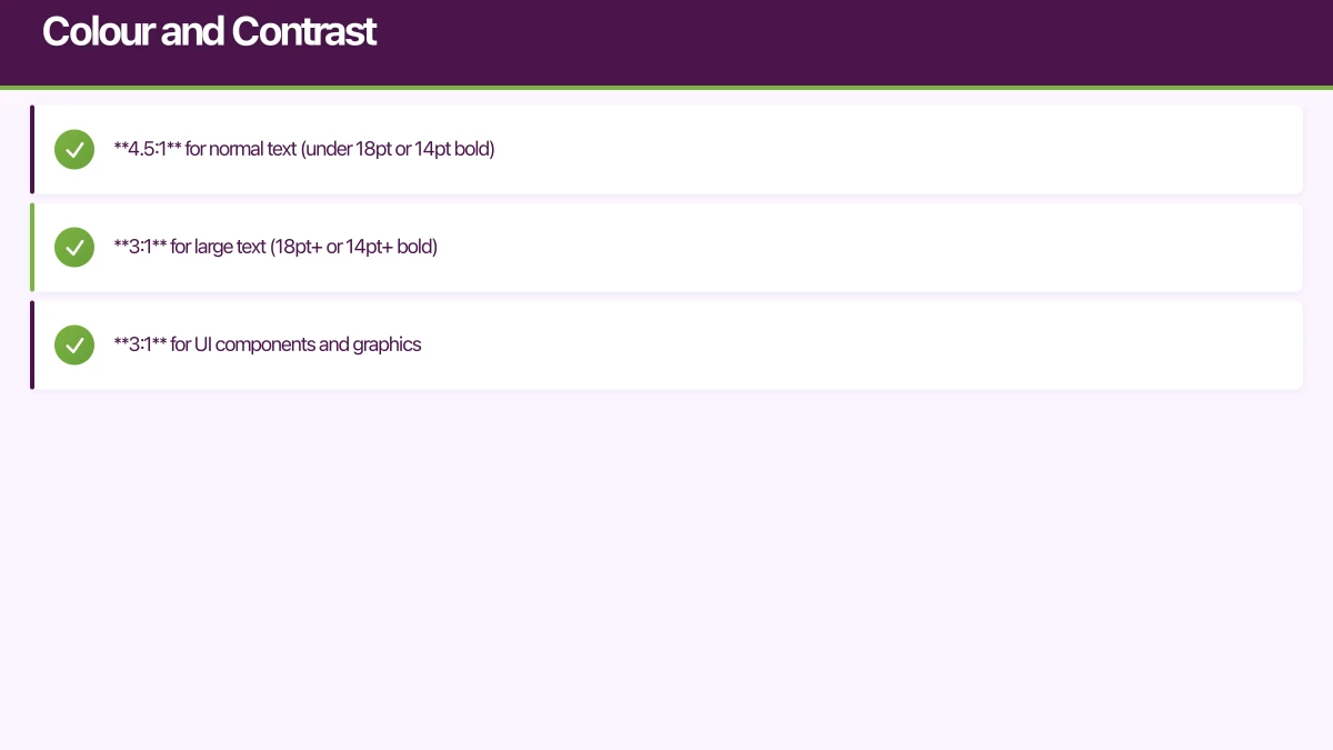
Minimum Contrast Ratios
WCAG AA requires:
- 4.5:1 for normal text (under 18pt or 14pt bold)
- 3:1 for large text (18pt+ or 14pt+ bold)
- 3:1 for UI components and graphics
Checking Contrast
// Calculate contrast ratio
function getContrastRatio(color1: string, color2: string): number {
  const luminance1 = getRelativeLuminance(color1);
  const luminance2 = getRelativeLuminance(color2);

  const lighter = Math.max(luminance1, luminance2);
  const darker = Math.min(luminance1, luminance2);

  return (lighter + 0.05) / (darker + 0.05);
}

function getRelativeLuminance(hexColor: string): number {
  const rgb = hexToRgb(hexColor);
  const [r, g, b] = rgb.map((c) => {
    c = c / 255;
    return c <= 0.03928 ? c / 12.92 : Math.pow((c + 0.055) / 1.055, 2.4);
  });
  return 0.2126 * r + 0.7152 * g + 0.0722 * b;
}

// Usage
const ratio = getContrastRatio('#333333', '#FFFFFF'); // Returns ~12.63
const meetsAA = ratio >= 4.5;
const meetsAAA = ratio >= 7;
Accessible Colour Palette
// Design system with accessible colours
const colors = {
  // Text colours with sufficient contrast on white
  text: {
    primary: '#1A1A1A',   // 16.5:1 on white
    secondary: '#4A4A4A', // 8.5:1 on white
    disabled: '#717171',  // 4.5:1 on white (minimum)
  },

  // Interactive colours
  interactive: {
    primary: '#0052CC',   // 7.1:1 on white
    hover: '#0747A6',     // 9.6:1 on white
    focus: '#0052CC',
  },

  // Status colours
  status: {
    error: '#C9252D',     // 5.6:1 on white
    success: '#006644',   // 7.9:1 on white
    warning: '#974F0C',   // 5.0:1 on white
  },

  // Ensure text on coloured backgrounds
  onPrimary: '#FFFFFF',   // 7.1:1 on #0052CC
  onError: '#FFFFFF',     // 5.6:1 on #C9252D
};
Don’t Rely on Colour Alone
Information conveyed by colour must have an additional visual indicator:
// Bad: Colour alone indicates status
<View style={{ backgroundColor: isValid ? 'green' : 'red' }} />

// Good: Icon + colour + text
<View style={styles.statusContainer}>
  <Icon
    name={isValid ? 'check-circle' : 'error'}
    color={isValid ? colors.success : colors.error}
  />
  <Text style={isValid ? styles.successText : styles.errorText}>
    {isValid ? 'Valid input' : 'Please correct this field'}
  </Text>
</View>
Touch Targets
Minimum Size Requirements
WCAG 2.1 Success Criterion 2.5.5 requires:
- 44x44 CSS pixels minimum for touch targets
Apple Human Interface Guidelines recommend:
- 44x44 points minimum
Material Design recommends:
- 48x48 dp minimum
// Ensure minimum touch target size
const styles = StyleSheet.create({
  touchableButton: {
    minHeight: 48,
    minWidth: 48,
    justifyContent: 'center',
    alignItems: 'center',
    padding: 12,
  },
  iconButton: {
    width: 48,
    height: 48,
    justifyContent: 'center',
    alignItems: 'center',
  },
  // For small visual elements, expand the touch area
  smallIconWrapper: {
    padding: 12, // Adds to the total touchable area
  },
});

function SmallIconButton({ icon, onPress, accessibilityLabel }) {
  return (
    <TouchableOpacity
      onPress={onPress}
      style={styles.smallIconWrapper}
      accessible={true}
      accessibilityLabel={accessibilityLabel}
      accessibilityRole="button"
    >
      <Icon name={icon} size={24} />
    </TouchableOpacity>
  );
}
Spacing Between Targets
Ensure adequate spacing to prevent accidental activation:
const styles = StyleSheet.create({
  buttonContainer: {
    flexDirection: 'row',
    gap: 8, // Minimum 8dp between adjacent targets
  },
  listItem: {
    padding: 16,
    marginBottom: 8, // Separation between items
  },
});
Form Accessibility
Labels and Instructions
function AccessibleForm() {
  const [email, setEmail] = useState('');
  const [emailError, setEmailError] = useState('');

  return (
    <View>
      {/* Visible label */}
      <Text
        nativeID="email-label"
        style={styles.label}
      >
        Email address
      </Text>

      {/* Helper text */}
      <Text
        nativeID="email-hint"
        style={styles.helperText}
      >
        We'll send your receipt to this address
      </Text>

      {/* Input with proper accessibility */}
      <TextInput
        value={email}
        onChangeText={setEmail}
        accessibilityLabel="Email address"
        accessibilityHint="We'll send your receipt to this address"
        accessibilityLabelledBy="email-label"
        accessibilityDescribedBy={emailError ? 'email-error' : 'email-hint'}
        accessibilityState={{
          disabled: false,
          error: !!emailError
        }}
        keyboardType="email-address"
        autoComplete="email"
        autoCapitalize="none"
        style={[
          styles.input,
          emailError ? styles.inputError : null
        ]}
      />

      {/* Error message */}
      {emailError && (
        <Text
          nativeID="email-error"
          style={styles.errorText}
          accessibilityRole="alert"
        >
          {emailError}
        </Text>
      )}
    </View>
  );
}
Error Handling
function validateAndSubmit() {
  const errors = validateForm(formData);

  if (Object.keys(errors).length > 0) {
    // Focus first error field
    const firstErrorField = Object.keys(errors)[0];
    refs[firstErrorField].current?.focus();

    // Announce errors to screen reader
    const errorSummary = Object.values(errors).join('. ');
    AccessibilityInfo.announceForAccessibility(
      `Form has ${Object.keys(errors).length} errors. ${errorSummary}`
    );

    setFormErrors(errors);
    return;
  }

  submitForm(formData);
}
Focus Management
Focus Indicators
Ensure visible focus states for keyboard/switch users:
const styles = StyleSheet.create({
  button: {
    padding: 12,
    borderRadius: 8,
    backgroundColor: colors.primary,
  },
  buttonFocused: {
    // Visible focus ring
    borderWidth: 3,
    borderColor: colors.focusRing,
    // Or use outline on web
  },
});

function AccessibleButton({ onPress, title }) {
  const [isFocused, setIsFocused] = useState(false);

  return (
    <TouchableOpacity
      onPress={onPress}
      onFocus={() => setIsFocused(true)}
      onBlur={() => setIsFocused(false)}
      style={[styles.button, isFocused && styles.buttonFocused]}
      accessible={true}
      accessibilityRole="button"
    >
      <Text style={styles.buttonText}>{title}</Text>
    </TouchableOpacity>
  );
}
Managing Focus on Navigation
function ProductScreen({ route }) {
  const headingRef = useRef<Text>(null);

  // Focus heading when screen becomes active
  useFocusEffect(
    useCallback(() => {
      // Small delay to ensure screen is rendered
      const timer = setTimeout(() => {
        headingRef.current?.focus();
        AccessibilityInfo.announceForAccessibility(
          `${route.params.productName} screen`
        );
      }, 100);

      return () => clearTimeout(timer);
    }, [route.params.productName])
  );

  return (
    <View>
      <Text
        ref={headingRef}
        accessibilityRole="header"
        accessible={true}
      >
        {route.params.productName}
      </Text>
      {/* Rest of screen */}
    </View>
  );
}
Modal Focus Trap
function AccessibleModal({ visible, onClose, children }) {
  const modalRef = useRef<View>(null);

  useEffect(() => {
    if (visible) {
      // Focus the modal when it opens
      AccessibilityInfo.setAccessibilityFocus(modalRef.current);
    }
  }, [visible]);

  if (!visible) return null;

  return (
    <Modal
      visible={visible}
      onRequestClose={onClose}
      transparent
    >
      <View style={styles.overlay}>
        <View
          ref={modalRef}
          style={styles.modalContent}
          accessible={true}
          accessibilityViewIsModal={true} // iOS: traps focus
          accessibilityRole="dialog"
          accessibilityLabel="Confirmation dialog"
        >
          {children}

          <TouchableOpacity
            onPress={onClose}
            accessibilityLabel="Close dialog"
            accessibilityRole="button"
          >
            <Text>Close</Text>
          </TouchableOpacity>
        </View>
      </View>
    </Modal>
  );
}
Motion and Animation
Respecting Reduced Motion
import { AccessibilityInfo, useReducedMotion } from 'react-native';

function AnimatedComponent() {
  // React Native 0.71+ hook
  const prefersReducedMotion = useReducedMotion();

  // For older versions
  const [reducedMotion, setReducedMotion] = useState(false);
  useEffect(() => {
    AccessibilityInfo.isReduceMotionEnabled().then(setReducedMotion);
    const subscription = AccessibilityInfo.addEventListener(
      'reduceMotionChanged',
      setReducedMotion
    );
    return () => subscription.remove();
  }, []);

  const animationConfig = prefersReducedMotion
    ? { duration: 0 } // No animation
    : { duration: 300, easing: Easing.bezier(0.25, 0.1, 0.25, 1) };

  return (
    <Animated.View style={animatedStyles}>
      {/* Content */}
    </Animated.View>
  );
}
Safe Animation Practices
// Avoid animations that could trigger vestibular issues
const safeAnimations = {
  // Good: Opacity fades
  fadeIn: {
    from: { opacity: 0 },
    to: { opacity: 1 },
    duration: 200,
  },

  // Good: Subtle scale
  scaleIn: {
    from: { transform: [{ scale: 0.95 }] },
    to: { transform: [{ scale: 1 }] },
    duration: 150,
  },

  // Avoid: Large parallax scrolling
  // Avoid: Zooming animations covering large areas
  // Avoid: Spinning/rotating animations
  // Avoid: Bouncing animations
};
Testing Accessibility
Manual Testing Checklist
-
Screen Reader Testing
- Navigate entire app with VoiceOver (iOS) and TalkBack (Android)
- Verify all content is announced
- Check logical reading order
- Test all interactive elements
-
Visual Testing
- Enable grayscale to test colour independence
- Test with display zoom/large text enabled
- Verify focus indicators are visible
- Check contrast ratios
-
Motor Testing
- Navigate with switch control
- Test with external keyboard
- Verify touch targets are adequate
Automated Testing
// Jest + Testing Library accessibility tests
import { render, screen } from '@testing-library/react-native';

describe('Accessibility', () => {
  it('button has accessible name', () => {
    render(<AddToCartButton product={mockProduct} />);

    const button = screen.getByRole('button', { name: /add to cart/i });
    expect(button).toBeTruthy();
  });

  it('image has alt text', () => {
    render(<ProductImage source={mockImage} name="Red Shoes" />);

    const image = screen.getByRole('image', { name: /red shoes/i });
    expect(image).toBeTruthy();
  });

  it('form inputs have labels', () => {
    render(<CheckoutForm />);

    expect(screen.getByLabelText(/email/i)).toBeTruthy();
    expect(screen.getByLabelText(/card number/i)).toBeTruthy();
  });

  it('error messages are announced', async () => {
    const { getByRole, getByText } = render(<LoginForm />);

    fireEvent.press(getByRole('button', { name: /sign in/i }));

    await waitFor(() => {
      const errorMessage = getByText(/email is required/i);
      expect(errorMessage.props.accessibilityRole).toBe('alert');
    });
  });
});
Axe DevTools for React Native
// Setup accessibility auditing in development
import { check } from 'react-native-a11y';

if (__DEV__) {
  check().then((issues) => {
    if (issues.length > 0) {
      console.warn('Accessibility issues found:', issues);
    }
  });
}
Compliance Documentation
Accessibility Statement
Provide users with information about your app’s accessibility:
Accessibility Statement for [App Name]

We are committed to ensuring digital accessibility for people with disabilities.
We are continually improving the user experience for everyone and applying the
relevant accessibility standards.

Conformance Status:
[App Name] is partially conformant with WCAG 2.1 level AA. Partially conformant
means that some parts of the content do not fully conform to the accessibility standard.

Known Limitations:
- Some third-party content may not be fully accessible
- [List specific known issues]

Feedback:
We welcome your feedback on the accessibility of [App Name]. Please let us know
if you encounter accessibility barriers:
- Email: [email protected]
- Phone: [Phone number]

We try to respond to feedback within 5 business days.

Assessment Approach:
[Company Name] assessed the accessibility of [App Name] by the following approaches:
- Self-evaluation
- External evaluation by [Auditor Name]

Date:
This statement was created on [Date] using the W3C Accessibility Statement Generator Tool.
VPAT (Voluntary Product Accessibility Template)
For enterprise customers, prepare a VPAT documenting compliance:
| Criteria | Conformance Level | Remarks |
|---|---|---|
| 1.1.1 Non-text Content | Supports | All images have text alternatives |
| 1.4.3 Contrast (Minimum) | Supports | All text meets 4.5:1 ratio |
| 2.1.1 Keyboard | Supports | All functionality keyboard accessible |
| 4.1.2 Name, Role, Value | Partially Supports | Some custom components need improvement |
Conclusion
Accessibility is a journey, not a destination. Start with the fundamentals: screen reader support, colour contrast, and touch targets. Then progressively improve as you learn from user feedback.
The most important step is testing with real assistive technology. Automated tools catch maybe 30% of issues. The rest require manual testing with VoiceOver, TalkBack, and ideally with users who rely on these technologies daily.
Building accessible apps from the start is significantly easier than retrofitting. Include accessibility in your design process, your development workflow, and your QA testing. Make it part of your definition of done.
Your accessible app will reach more users, face fewer legal risks, and simply be better for everyone who uses it.
Need help making your mobile app accessible? Our team has implemented accessibility for apps used by millions. Contact us for an accessibility audit or implementation assistance.
Scaling your app’s backend? Cloud Geeks specialises in cloud infrastructure that grows with your user base across Australia.
Part of the Ganda Tech Services family, Awesome Apps delivers specialist mobile app development for Australian small and medium businesses.
Talk to a Sydney app developer — free.
30 minutes. We'll tell you what your app needs, how long it takes, and what it costs. Real answers, no sales pitch.
Book Free App Strategy Call →Free · 30 minutes · No obligation