Building accessible mobile apps isn’t just about compliance—it’s about reaching the 4.4 million Australians (18% of the population) with disability. Yet most mobile developers ship apps that create unnecessary barriers for users with visual, motor, hearing, or cognitive impairments.
The good news? Both iOS and Android provide robust accessibility APIs. The challenge is understanding how WCAG 2.1 guidelines translate to mobile platforms, and implementing them correctly without breaking your existing UX. After shipping accessible apps for banking, healthcare, and government clients, here’s what actually matters when building WCAG-compliant mobile experiences.
Understanding WCAG for Mobile Apps
Web Content Accessibility Guidelines (WCAG) 2.1, while originally designed for web content, form the foundation for mobile app accessibility. The standard defines three conformance levels:
- Level A: Basic accessibility features (minimum requirement)
- Level AA: Recommended standard for most apps (target for compliance)
- Level AAA: Enhanced accessibility (ideal but not always feasible)
Most regulatory requirements—including the Australian Disability Discrimination Act and US Section 508—expect Level AA conformance.
The Four WCAG Principles for Mobile
Perceivable: Users must be able to perceive the information being presented. This means providing text alternatives for images, sufficient color contrast, and adaptable content that works with assistive technologies.
Operable: Users must be able to operate interface components and navigation. This includes keyboard/switch control access, sufficient time to complete tasks, and avoiding designs that trigger seizures.
Understandable: Information and operation of the user interface must be understandable. Use clear language, predictable behavior, and provide input assistance when needed.
Robust: Content must be robust enough to work with current and future assistive technologies. This means using platform accessibility APIs correctly and testing with real screen readers.
iOS Accessibility wi
 th VoiceOver
VoiceOver is Apple’s built-in screen reader, used by blind and low-vision users to navigate iOS apps. Making your SwiftUI or UIKit app work seamlessly with VoiceOver requires understanding accessibility traits, labels, and hints.
Implementing Accessibility Labels in SwiftUI
Every interactive element needs a descriptive accessibility label that conveys its purpose:
import SwiftUI

struct ProfileView: View {
    @State private var username = "ashganda"
    @State private var notificationCount = 3

    var body: some View {
        VStack(spacing: 20) {
            // Image with descriptive label
            Image("profile-photo")
                .resizable()
                .frame(width: 100, height: 100)
                .clipShape(Circle())
                .accessibilityLabel("Profile photo")

            // Badge with dynamic label
            HStack {
                Image(systemName: "bell.fill")
                Text("\(notificationCount)")
            }
            .accessibilityElement(children: .ignore)
            .accessibilityLabel("Notifications")
            .accessibilityValue("\(notificationCount) unread")
            .accessibilityHint("Double tap to view notifications")

            // Button with clear action
            Button("Edit Profile") {
                editProfile()
            }
            .accessibilityLabel("Edit profile")
            .accessibilityHint("Opens profile editing screen")
        }
    }

    private func editProfile() {
        // Implementation
    }
}
Key principles demonstrated here:
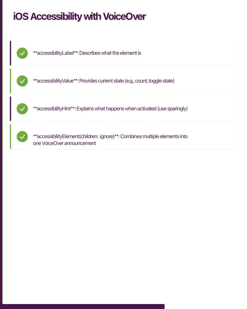
- accessibilityLabel: Describes what the element is
- accessibilityValue: Provides current state (e.g., count, toggle state)
- accessibilityHint: Explains what happens when activated (use sparingly)
- accessibilityElement(children: .ignore): Combines multiple elements into one VoiceOver announcement
UIKit Accessibility Implementation
For UIKit-based apps, the approach is similar but uses direct property assignment:
import UIKit

class NotificationBadge: UIView {
    private let countLabel = UILabel()
    private let iconView = UIImageView()

    var count: Int = 0 {
        didSet {
            updateAccessibility()
        }
    }

    override init(frame: CGRect) {
        super.init(frame: frame)
        setupView()
        updateAccessibility()
    }

    required init?(coder: NSCoder) {
        fatalError("init(coder:) has not been implemented")
    }

    private func setupView() {
        // Combine icon and label into single accessible element
        isAccessibilityElement = true

        // Visual setup
        addSubview(iconView)
        addSubview(countLabel)

        iconView.image = UIImage(systemName: "bell.fill")
        iconView.isAccessibilityElement = false
        countLabel.isAccessibilityElement = false
    }

    private func updateAccessibility() {
        accessibilityLabel = "Notifications"
        accessibilityValue = "\(count) unread"
        accessibilityHint = "Double tap to view notifications"
        accessibilityTraits = .button
    }
}
Accessibility Traits Matter
Setting the correct accessibility trait tells VoiceOver how to announce the element:
// Common traits
view.accessibilityTraits = .button          // "Button" announced
view.accessibilityTraits = .header          // Helps with navigation
view.accessibilityTraits = .staticText      // Non-interactive text
view.accessibilityTraits = [.button, .selected]  // Combine traits
Android Acces
sibility with TalkBack
TalkBack is Android’s screen reader, and it requires similar consideration but with Android-specific implementation patterns.
Implementing Content Descriptions in Jetpack Compose
Jetpack Compose makes accessibility a first-class concern with built-in modifiers:
import androidx.compose.foundation.Image
import androidx.compose.foundation.layout.*
import androidx.compose.material3.*
import androidx.compose.runtime.*
import androidx.compose.ui.Modifier
import androidx.compose.ui.semantics.*
import androidx.compose.ui.unit.dp

@Composable
fun ProfileScreen() {
    var notificationCount by remember { mutableStateOf(3) }

    Column(
        modifier = Modifier.padding(16.dp),
        verticalArrangement = Arrangement.spacedBy(20.dp)
    ) {
        // Image with content description
        Image(
            painter = painterResource(id = R.drawable.profile_photo),
            contentDescription = "Profile photo",
            modifier = Modifier.size(100.dp)
        )

        // Badge with custom semantics
        Row(
            modifier = Modifier
                .semantics(mergeDescendants = true) {
                    contentDescription = "Notifications, $notificationCount unread"
                    role = Role.Button
                    stateDescription = "$notificationCount unread notifications"
                }
                .clickable { viewNotifications() }
        ) {
            Icon(
                imageVector = Icons.Default.Notifications,
                contentDescription = null // Merged into parent
            )
            Text("$notificationCount")
        }

        // Button with clear action
        Button(
            onClick = { editProfile() },
            modifier = Modifier.semantics {
                contentDescription = "Edit profile"
            }
        ) {
            Text("Edit Profile")
        }
    }
}
Key Compose accessibility modifiers:
- contentDescription: Describes the element to TalkBack
- semantics(mergeDescendants = true): Combines children into single announcement
- role: Defines the semantic role (Button, Checkbox, etc.)
- stateDescription: Provides current state information
XML View Accessibility
For traditional Android Views, use XML attributes and programmatic properties:
{/* res/layout/notification_badge.xml */}
<LinearLayout
    android:layout_width="wrap_content"
    android:layout_height="wrap_content"
    android:orientation="horizontal"
    android:contentDescription="@string/notifications_label"
    android:clickable="true"
    android:focusable="true">

    <ImageView
        android:layout_width="24dp"
        android:layout_height="24dp"
        android:src="@drawable/ic_notifications"
        android:importantForAccessibility="no" />

    <TextView
        android:id="@+id/notification_count"
        android:layout_width="wrap_content"
        android:layout_height="wrap_content"
        android:importantForAccessibility="no"
        android:text="3" />
</LinearLayout>
// In your Activity or Fragment
class NotificationBadgeView(context: Context) : LinearLayout(context) {
private var count: Int = 0
set(value) {
field = value
updateAccessibility()
}
private fun updateAccessibility() {
contentDescription = "Notifications, $count unread"
// Announce changes to screen reader
if (count > 0) {
announceForAccessibility("$count new notifications")
}
}
}Color Contrast an
d Visual Accessibility
WCAG requires a minimum contrast ratio of 4.5:1 for normal text and 3:1 for large text (18pt+ or 14pt+ bold). This is one of the most commonly failed requirements.
Testing Contrast Ratios
Use tools like the WebAIM Contrast Checker or built-in platform tools:
// iOS - Check with Accessibility Inspector in Xcode
// View > Accessibility > Audit to find contrast issues

// Example of providing sufficient contrast
extension Color {
    static let primaryText = Color(
        light: Color(hex: "#1A1A1A"),  // Almost black on white: 16.1:1
        dark: Color(hex: "#F5F5F5")    // Almost white on black: 16.1:1
    )

    static let secondaryText = Color(
        light: Color(hex: "#666666"),  // Gray on white: 5.74:1 [x]
        dark: Color(hex: "#AAAAAA")    // Light gray on black: 7.15:1 [x]
    )
}
// Android - Use Accessibility Scanner app from Play Store
// Tools > Layout Inspector shows contrast warnings
// Define accessible colors
object AppColors {
// Normal text requires 4.5:1 contrast
val primaryText = Color(0xFF1A1A1A) // 16.1:1 on white [x]
val secondaryText = Color(0xFF666666) // 5.74:1 on white [x]
// Large text requires 3:1 contrast
val headingText = Color(0xFF404040) // 10.37:1 on white [x]
// Interactive elements need 3:1 against background
val buttonBackground = Color(0xFF0066CC) // 4.54:1 on white [x]
}Don’t Rely on Color Alone
WCAG Success Criterion 1.4.1 requires that color isn’t the only way to convey information:
// [x] Bad: Only color indicates status
Text("Available")
    .foregroundColor(.green)

// [x] Good: Icon + color + text
HStack {
    Image(systemName: "checkmark.circle.fill")
        .foregroundColor(.green)
    Text("Available")
}
.accessibilityElement(children: .combine)
.accessibilityLabel("Status: Available")
Touch Target Sizes
WCAG Success Criterion 2.5.5 (Level AAA) recommends touch targets of at least 44x44 points. While this is AAA, it’s a best practice that significantly improves usability for users with motor impairments.
iOS Touch Target Implementation
struct AccessibleButton: View {
    let title: String
    let action: () -> Void

    var body: some View {
        Button(action: action) {
            Text(title)
                .frame(minWidth: 44, minHeight: 44)
                .padding(.horizontal, 16)
        }
        .accessibilityLabel(title)
    }
}

// For smaller visual elements, expand the hit area invisibly
struct IconButton: View {
    let iconName: String
    let action: () -> Void

    var body: some View {
        Button(action: action) {
            Image(systemName: iconName)
                .font(.system(size: 20))
                .frame(width: 44, height: 44)  // Expand hit area
        }
    }
}
Android Touch Target Implementation
// Compose
@Composable
fun AccessibleIconButton(
    onClick: () -> Unit,
    icon: ImageVector,
    contentDescription: String
) {
    IconButton(
        onClick = onClick,
        modifier = Modifier.size(48.dp)  // Material Design minimum
    ) {
        Icon(
            imageVector = icon,
            contentDescription = contentDescription,
            modifier = Modifier.size(24.dp)  // Visual size smaller than touch area
        )
    }
}

// XML View - use TouchDelegate for smaller views
val deleteButton: ImageView = findViewById(R.id.delete_button)
val parent = deleteButton.parent as View

parent.post {
    val delegateArea = Rect()
    deleteButton.getHitRect(delegateArea)

    // Expand touch area by 12dp in all directions
    val extraSpace = (12 * resources.displayMetrics.density).toInt()
    delegateArea.apply {
        top -= extraSpace
        bottom += extraSpace
        left -= extraSpace
        right += extraSpace
    }

    parent.touchDelegate = TouchDelegate(delegateArea, deleteButton)
}
Dynamic Type and Text Scaling
Both platforms support user-controlled text sizing for low-vision users. Your layouts must adapt gracefully.
iOS Dynamic Type
struct ArticleView: View {
    var body: some View {
        VStack(alignment: .leading, spacing: 8) {
            Text("Article Title")
                .font(.title)  // Automatically scales with Dynamic Type

            Text("Article body content here...")
                .font(.body)
                .lineLimit(nil)  // Allow unlimited lines
        }
        .padding()
    }
}

// For custom fonts, support Dynamic Type
extension Font {
    static func customFont(size: CGFloat) -> Font {
        return .custom("YourCustomFont", size: size, relativeTo: .body)
    }
}
Android Text Scaling
// Compose - Use sp units which scale with user preferences
@Composable
fun ArticleView() {
    Column(
        modifier = Modifier.padding(16.dp),
        verticalArrangement = Arrangement.spacedBy(8.dp)
    ) {
        Text(
            text = "Article Title",
            style = MaterialTheme.typography.headlineMedium  // Scales automatically
        )

        Text(
            text = "Article body content here...",
            style = MaterialTheme.typography.bodyMedium,
            maxLines = Int.MAX_VALUE  // Allow text to wrap
        )
    }
}

// Avoid hardcoded text sizes
// [x] fontSize = 16.dp  (doesn't scale)
// [x] fontSize = 16.sp  (scales with user settings)
Testing Accessibility
Automated testing catches basic issues, but manual testing with real screen readers is essential.
iOS Testing Workflow
-
Accessibility Inspector: Xcode > Open Developer Tool > Accessibility Inspector
- Audit feature finds contrast, label, and hit area issues
- Inspection shows accessibility properties of elements
-
VoiceOver Testing: Enable on device or simulator
- Settings > Accessibility > VoiceOver
- Navigate with two-finger swipe (simulator: Option + Arrow keys)
- Test that all interactive elements are reachable
- Verify labels make sense without visual context
-
Automated Tests:
import XCTest

class AccessibilityTests: XCTestCase {
    func testButtonHasAccessibilityLabel() {
        let app = XCUIApplication()
        app.launch()

        let saveButton = app.buttons["Save"]
        XCTAssertTrue(saveButton.exists)
        XCTAssertEqual(saveButton.label, "Save")
    }

    func testImageHasAccessibilityLabel() {
        let app = XCUIApplication()
        app.launch()

        let profileImage = app.images["Profile photo"]
        XCTAssertTrue(profileImage.exists)
    }
}
Android Testing Workflow
-
Accessibility Scanner: Download from Play Store
- Scans screens for common issues
- Provides specific suggestions for fixes
- Checks contrast, touch targets, labels
-
TalkBack Testing: Enable in device settings
- Settings > Accessibility > TalkBack
- Navigate with swipe right/left
- Verify content descriptions make sense
- Test that focus order is logical
-
Automated Tests:
import androidx.compose.ui.test.*
import androidx.compose.ui.test.junit4.createComposeRule
import org.junit.Rule
import org.junit.Test

class AccessibilityTests {
    @get:Rule
    val composeTestRule = createComposeRule()

    @Test
    fun buttonHasContentDescription() {
        composeTestRule.setContent {
            ProfileScreen()
        }

        composeTestRule
            .onNodeWithContentDescription("Edit profile")
            .assertExists()
            .assertHasClickAction()
    }

    @Test
    fun imageHasContentDescription() {
        composeTestRule.setContent {
            ProfileScreen()
        }

        composeTestRule
            .onNodeWithContentDescription("Profile photo")
            .assertExists()
    }
}
Legal Requirements and Compliance
In Australia, the Disability Discrimination Act 1992 requires equal access to services, which extends to mobile apps. Internationally, Section 508 (US) and EN 301 549 (EU) set specific technical requirements.
Key Compliance Points
Australia: The DDA doesn’t specify technical standards but references WCAG 2.1 Level AA as best practice. Recent cases have found against organizations with inaccessible digital services.
United States: Section 508 requires federal agencies and contractors to meet WCAG 2.0 Level AA. Many states have broader requirements.
European Union: EN 301 549 mandates WCAG 2.1 Level AA for public sector apps and increasingly for private sector under the European Accessibility Act.
Documenting Compliance
Create a VPAT (Voluntary Product Accessibility Template) or ACR (Accessibility Conformance Report):
# Accessibility Conformance Report
App: YourApp v2.0
Date: January 2024
Standard: WCAG 2.1 Level AA

## Success Criteria

### 1.1.1 Non-text Content (Level A)
**Status**: Supports
**Notes**: All images include accessibility labels. Decorative images marked as such.

### 1.4.3 Contrast (Minimum) (Level AA)
**Status**: Supports
**Notes**: All text meets 4.5:1 contrast ratio. Large text meets 3:1.

### 2.4.7 Focus Visible (Level AA)
**Status**: Supports
**Notes**: Focus indicators visible on all interactive elements.
Practical Implementation Checklist
Before shipping your app, verify:
- All images have accessibility labels or are marked decorative
- Interactive elements have clear labels and hints
- Text contrast meets 4.5:1 (normal) or 3:1 (large text)
- Touch targets are at least 44x44 points
- Layout adapts to Dynamic Type / text scaling
- Logical focus order for screen reader navigation
- No information conveyed by color alone
- Forms provide input assistance and error messages
- Tested with VoiceOver and TalkBack
- Video content includes captions
- Time limits can be extended or disabled
- No content flashes more than 3 times per second
Moving Forward with Accessibility
Building accessible mobile apps requires upfront investment but pays dividends in reach, legal compliance, and user satisfaction. Start with the fundamentals—labels, contrast, touch targets—and progressively enhance from there.
The ecosystem is improving rapidly. SwiftUI and Jetpack Compose make accessibility more declarative and easier to get right. Xcode’s Accessibility Inspector and Android’s Accessibility Scanner catch issues early. Screen reader testing, while time-consuming, reveals usability issues that benefit all users.
Most importantly, accessibility isn’t a checkbox exercise. It’s about ensuring your app works for everyone who wants to use it—including the nearly one in five Australians with disability. The technical implementation is straightforward once you understand the platform APIs and WCAG principles. The hard part is making it a priority from the start of your project.
Building an accessible app for your startup? eawesome.com.au specializes in inclusive mobile development for Australian founders. We build React Native, Flutter, and native apps that work beautifully for all users.
Your app needs secure, low-latency APIs. Cloud Geeks builds and manages cloud backends optimised for mobile applications.
Awesome Apps is the mobile development division of Ganda Tech Services, building iOS and Android apps for Australian businesses.
Talk to a Sydney app developer — free.
30 minutes. We'll tell you what your app needs, how long it takes, and what it costs. Real answers, no sales pitch.
Book Free App Strategy Call →Free · 30 minutes · No obligation