Introduction
The first few minutes after someone downloads your app determine whether they become an active user or uninstall by tomorrow. Industry data suggests that most apps lose the majority of their users within the first week—often within the first session.
Your onboarding flow is your one chance to demonstrate value quickly enough to earn continued attention. This guide covers how to design onboarding that actually works.
Why Onboarding Matters
The Retention Challenge
Typical app retention looks something like:
- Day 1: 25-35% of users return
- Day 7: 10-15% still active
- Day 30: 5-10% remain
Poor onboarding accelerates this decline. Good onboarding can significantly improve these numbers.
The Value Equation
Users are constantly evaluating:
Is the value I’m getting worth the effort I’m putting in?
Onboarding is where you tip this equation in your favour—demonstrating value while minimising friction.
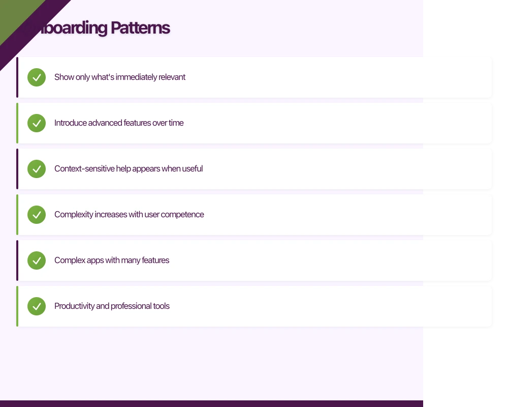
Onboarding Patterns
Progressive Disclosure
Reveal features as users need them rather than all at once.
How It Works
- Show only what’s immediately relevant
- Introduce advanced features over time
- Context-sensitive help appears when useful
- Complexity increases with user competence
When to Use
- Complex apps with many features
- Productivity and professional tools
- Apps where users grow into advanced usage
Example Flow
First session: Core functionality only After first completed action: Related feature introduction After a week: Advanced features revealed Based on usage: Power user tips
Walkthrough Tours
Step-by-step introduction to key features.
How It Works
- Guided sequence of screens
- Highlights key interface elements
- Often uses overlays or tooltips
- Usually skippable
When to Use
- Novel or unfamiliar interfaces
- Apps with non-obvious functionality
- When you need to explain value proposition
Making Tours Effective
- Keep them short (3-5 screens maximum)
- Focus on benefits, not features
- Make skip option visible
- Don’t repeat for returning users
Learn by Doing
Guide users through actual tasks instead of showing tutorials.
How It Works
- User completes real actions
- Guidance appears contextually
- Success reinforced with feedback
- Progress feels meaningful
When to Use
- Apps with clear initial actions
- When demonstration beats explanation
- Games and interactive apps
- Content creation tools
Example
Instead of: “Tap here to create a new note” Use: “Create your first note” with helpful prompts as they complete the action
Empty States
Use the initial empty experience as a teaching moment.
How It Works
- Empty screens include helpful guidance
- Suggest first actions
- Show examples of filled state
- Provide starting templates
When to Use
- Content creation apps
- Social apps
- Productivity tools
- Any app starting with a blank slate
Key Onboarding Elements
Account Creation
Defer When Possible
Don’t require signup before demonstrating value:
- Let users explore first
- Request account when needed (to save, sync, or access features)
- Explain why account is beneficial
When Immediate Login Required
- Make it quick (social login options)
- Minimise required fields
- Enable biometric login for returns
- Show what they’ll get after signing up
Permission Requests
Ask in Context
Request permissions when they’re needed:
- Photo permission when user wants to add an image
- Location permission when accessing location feature
- Notification permission after user sees value
Pre-Permission Priming
Before the system dialog:
- Explain why you need the permission
- Describe the benefit to the user
- Give them context for the decision
Handle Denial Gracefully
When permissions are denied:
- Don’t break the app
- Offer alternatives where possible
- Explain how to enable later if needed
- Don’t repeatedly ask
Value Demonstration
Show, Don’t Tell
Instead of: “Our app helps you save money” Show: A calculation of potential savings with their input
Instead of: “Connect with friends easily” Show: A preview of their imported contacts
Quick Wins
Design for early success:
- First accomplishment within 30 seconds
- Celebrate small victories
- Make initial tasks achievable
- Build momentum through completion
Personalisation
Early Configuration
When customisation improves experience:
- Collect preferences upfront (briefly)
- Explain how preferences will be used
- Make it feel like progress, not work
- Allow changes later
Recommendation: Keep Initial Preferences Minimal
Too many questions feels like a barrier:
- 2-3 preference questions maximum
- Visual selection over typing
- Skip option with sensible defaults
- Refinement over time through usage
Implementation Considerations
Platform Guidelines
iOS Onboarding
Apple’s Human Interface Guidelines recommend:
- Fast launch experience
- Minimal setup before functionality
- Learn by doing over tutorials
- Respect user’s time
Android Onboarding
Material Design recommends:
- Self-select options limited to key differentiators
- Clear navigation and exit options
- Consistent with overall app design
- Progressive complexity
Technical Implementation
Tracking Onboarding Progress
Track where users drop off:
// Example tracking points
analytics.track("onboarding_started")
analytics.track("onboarding_step_1_completed")
analytics.track("onboarding_step_2_completed")
analytics.track("onboarding_completed")
analytics.track("onboarding_skipped", properties: ["step": currentStep])
State Management
Remember onboarding state:
- Store completion status locally
- Sync with backend for multi-device
- Handle returning users appropriately
- Consider re-onboarding for major updates
A/B Testing
Test onboarding variations:
- Different flow lengths
- Various permission timing
- Alternate value propositions
- With and without tutorials
Performance Considerations
First Launch Matters
First launch is often the slowest:
- Optimise for cold start time
- Defer non-essential initialisation
- Show meaningful UI quickly
- Consider placeholder content while loading
Common Mistakes
Information Overload
The Problem
Showing every feature immediately overwhelms users. They can’t absorb it all and remember nothing.
The Fix
Prioritise ruthlessly. What’s the one thing a new user must understand? Start there.
Feature-Focused Messaging
The Problem
“We have 47 features!” doesn’t resonate with users who just want to solve their problem.
The Fix
Focus on benefits and outcomes. What will users be able to do? How will their life improve?
Forced Tours
The Problem
Unskippable tutorials frustrate users who want to explore independently.
The Fix
Always provide skip options. Make tours available but not mandatory.
Friction Before Value
The Problem
Requiring signup, permissions, or preferences before users understand why creates abandonment.
The Fix
Demonstrate value first. Earn the right to ask for investment.
Ignoring Returning Users
The Problem
Re-showing onboarding to returning users wastes their time and signals poor design.
The Fix
Track completion state. Provide appropriate experience for different user states.
Set-and-Forget
The Problem
Onboarding designed once and never reviewed despite changing user behaviour.
The Fix
Monitor onboarding metrics. Iterate based on where users struggle or drop off.
Measuring Onboarding Success
Key Metrics
Completion Rate
What percentage of users complete onboarding?
- Track step-by-step progression
- Identify drop-off points
- Compare with skip rates
Time to First Value
How quickly do users complete their first meaningful action?
- Define what “meaningful” means for your app
- Measure time from first open
- Compare before and after changes
Retention Correlation
How does onboarding impact retention?
- Compare retention for completers vs. skippers
- Segment by onboarding variations
- Track long-term impact
Qualitative Feedback
Numbers don’t tell the whole story:
- User testing with new users
- App store reviews mentioning first experience
- Support tickets about getting started
- Session recordings of first-time users
Iteration Strategy
Identify Problems
Use data to find issues:
- High drop-off at specific step?
- Low permission grant rates?
- Users skipping but then churning?
- Specific device or OS issues?
Test Solutions
Small, measurable changes:
- Change one element at a time
- Sufficient sample size
- Statistical significance
- Monitor downstream impact
Evolve Over Time
Onboarding should adapt:
- As product evolves
- As user expectations change
- As you learn from data
- As competition shifts
Conclusion
Onboarding is the most important user experience in your app. It’s where first impressions are formed, where value must be demonstrated, and where the relationship between user and app begins.
Design for success: minimise friction, demonstrate value quickly, and guide users to their first win. Test, measure, and iterate relentlessly.
The users who make it through onboarding successfully are far more likely to become the engaged, retained users who make your app successful.
Thinking beyond the app to your overall digital roadmap? Ash Ganda shares strategic insights for Australian technology leaders.
Ashish Ganda is the founder of Ganda Tech Services, a Sydney-based technology consultancy helping Australian businesses grow through cloud, web, and mobile solutions.
Talk to a Sydney app developer — free.
30 minutes. We'll tell you what your app needs, how long it takes, and what it costs. Real answers, no sales pitch.
Book Free App Strategy Call →Free · 30 minutes · No obligation